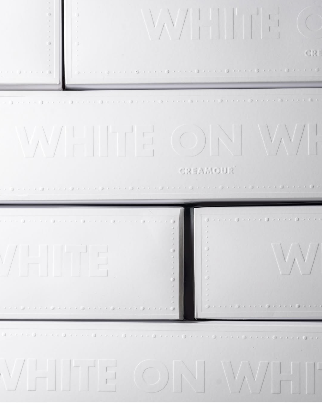
Creamour
A chocolate and sweet house that speaks in texture, not volume.
Creamour needed a packaging language premium enough for gifting yet quiet enough to sit in a modern pantry. We built a tonal system where material does the talking.
- Sector
- Confectionery / Gifting
- Services
- Packaging system, art direction, print supervision
- Year
- 2025
- Projects
- 5 releases
Challenge
The category leans on gloss, foil and loud colour. Creamour wanted shelf presence without shouting, and a structure that scales from single bar to gift stack.
Approach
One grid across every box size, a blind-deboss mark on uncoated stock, and a paired dark range that shifts only in tone and texture, never in structure.
Outcome
A range that reads as one family from two metres away and rewards a closer look in hand, with campaign photography treating cocoa as raw terrain.
Selected outputs
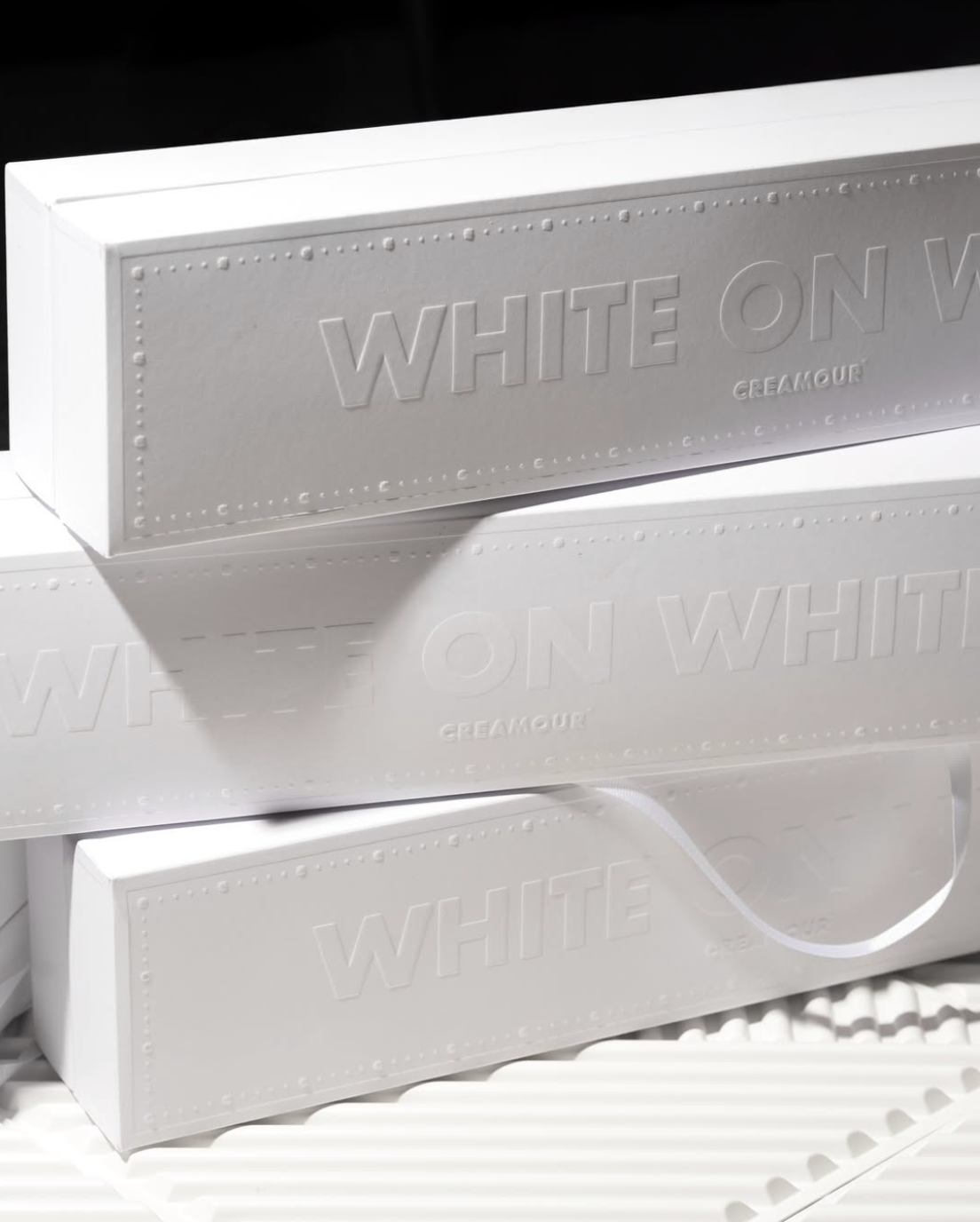
Embossed Box Series
A stackable family of boxes built on one grid, so every size reads as the same brand on shelf and in hand.
- Scope
- Box system across three sizes
- Material
- Rigid board with magnetic closure
- Finish
- Embossed lid, matte lamination
- Year
- 2025
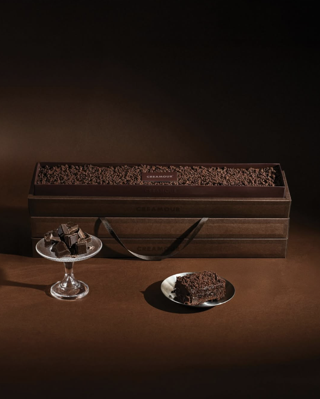
Dark Cocoa Edition
The dark counterpart to the white range, deep cocoa tones and a warmer paper texture signalling intensity of flavour.
- Scope
- Range extension, colour system
- Palette
- Cocoa brown, bitter espresso, cream
- Finish
- Soft-touch matte with gloss spot mark
- Year
- 2025
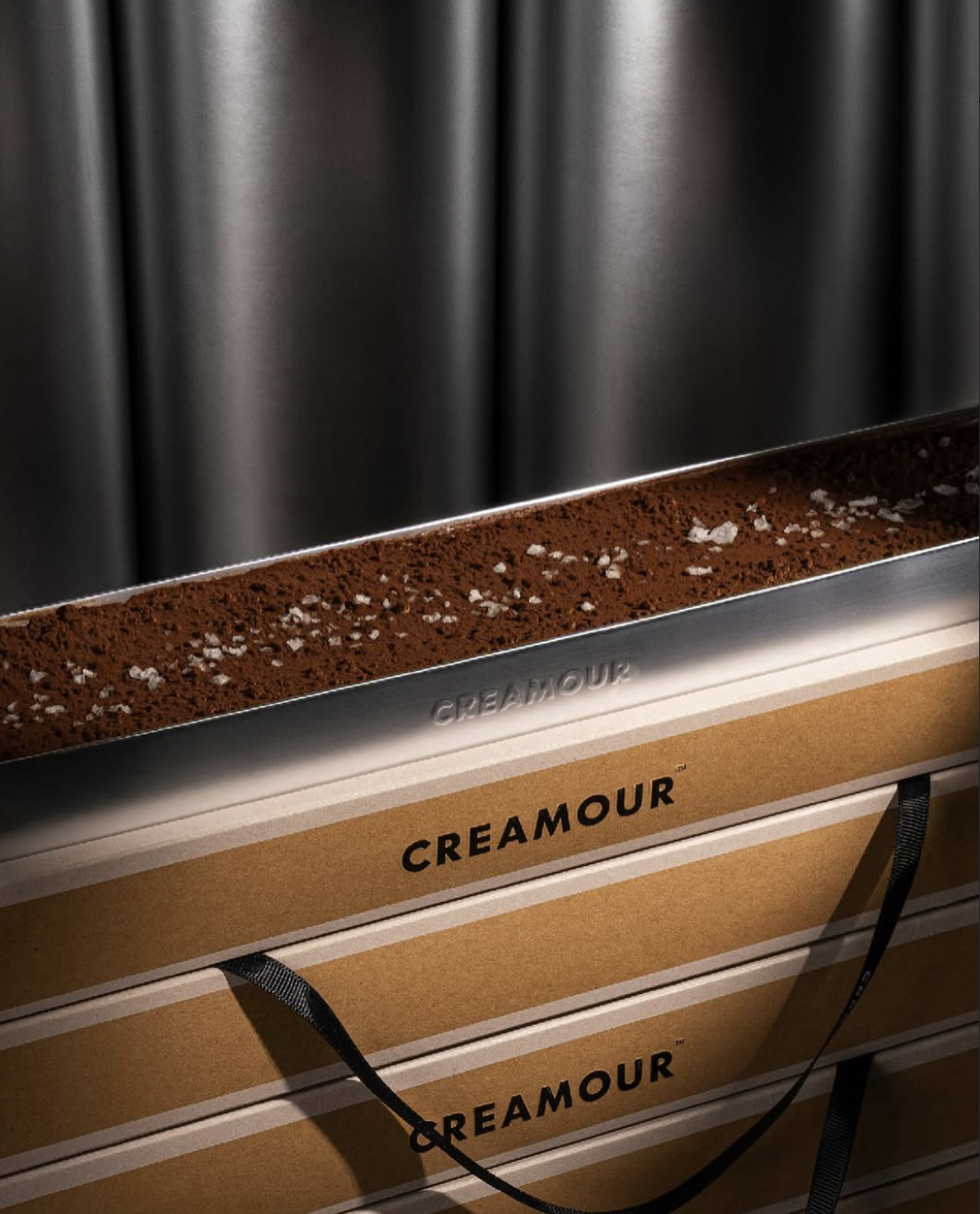
Salted Cocoa Campaign
Macro product photography treating chocolate flake as texture and terrain, art direction built around raw material, not styling props.
- Scope
- Art direction, photography, retouching
- Output
- Campaign key visuals, social cutdowns
- Lighting
- Single-source hard light, deep falloff
- Year
- 2025
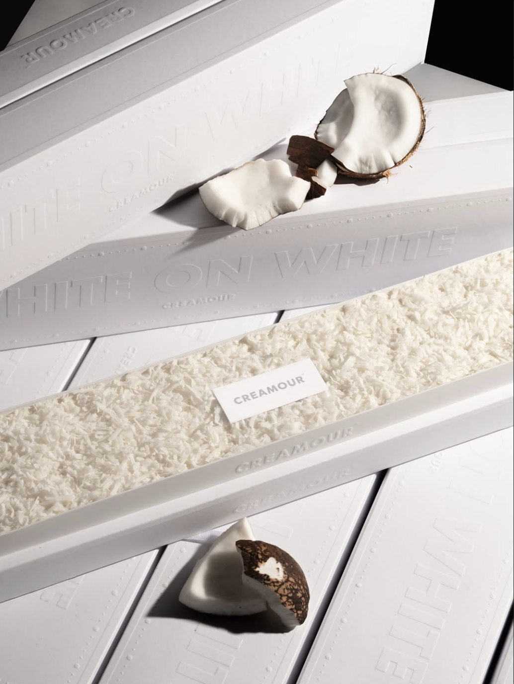
Coconut Edition
A lighter flavour variant expressed through raw coconut styling and the same restrained white system as the core range.
- Scope
- Variant packaging, styling direction
- Palette
- Bone white, coconut shell, natural fibre
- Finish
- Uncoated stock, tactile edge
- Year
- 2025
All projects
View all workReady to build your next brand?.
Let's create something remarkable.