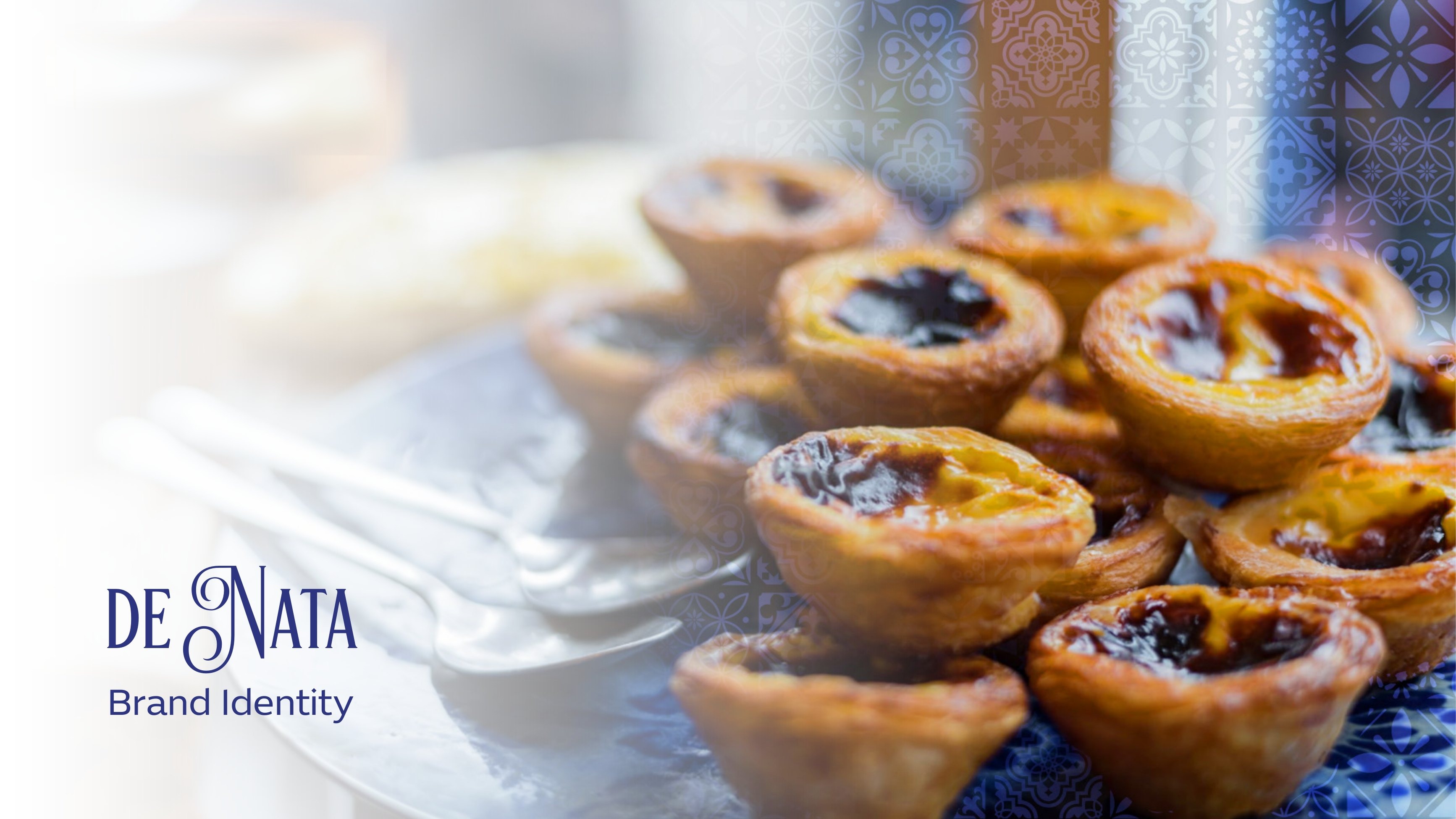
De Nata
Lisbon, translated for the Gulf.
A complete brand world for a pastéis de nata house, crest, azulejo tile system, a full take-away packaging range from single-serve to 49-piece gift drawer, plus uniforms, stationery, RTD cans and in-store graphics.
- Sector
- Bakery & coffee
- Services
- Identity, packaging system, uniforms, environmental graphics
- Cities
- Lisbon · Riyadh
- Languages
- Arabic · Portuguese · English
- Projects
- 22 releases
- Year
- 2024, 2026
Challenge
Portuguese custard tarts arrive in the region with no visual shorthand. The brand had to feel authentically Lisbon while reading naturally in Arabic, across counters in Lisbon and Riyadh.
Approach
One crest, one navy, one amber, and an azulejo tile band that behaves like a signature, vertical on bags, horizontal on boxes, floor-to-ceiling on walls. Portuguese greetings and a Fernando Pessoa line carry the voice bilingually.
Outcome
A range where every format, from a sugar sachet to a 49-piece drawer box, is recognisable from two metres and rewards a closer read in hand.
Selected outputs
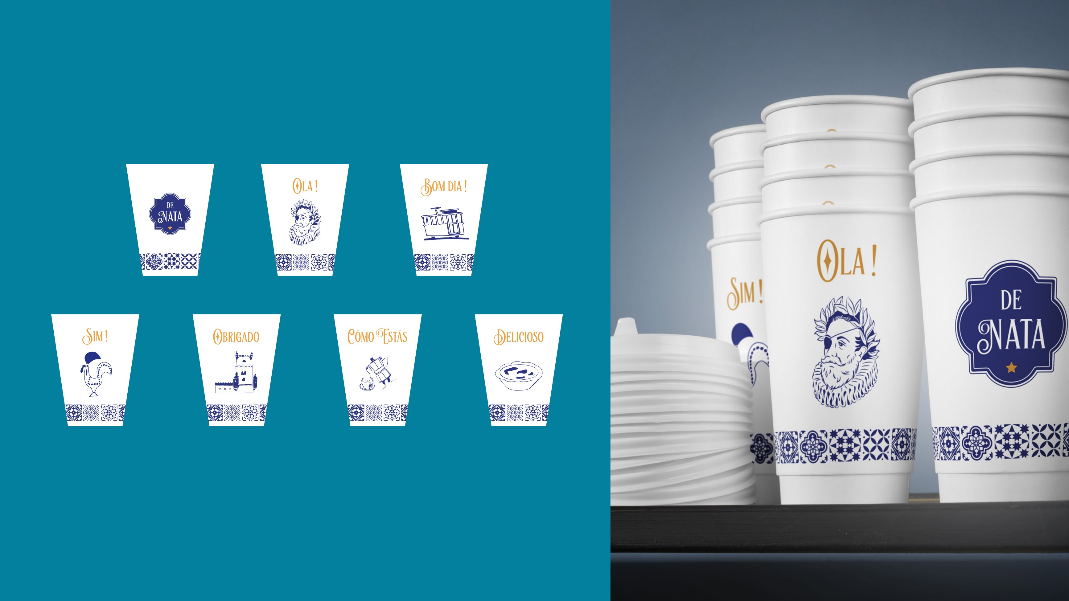
Coffee Cup Range
Seven hot-cup variants carrying Portuguese greetings, Cómo Estás, Olá, Bom Dia, each paired with a small line illustration so the cup reads as a phrase, not a logo repeated seven times.
- Scope
- Cup range design
- System
- 7 greeting variants
- Language
- Portuguese phrases + line icons
- Year
- 2024
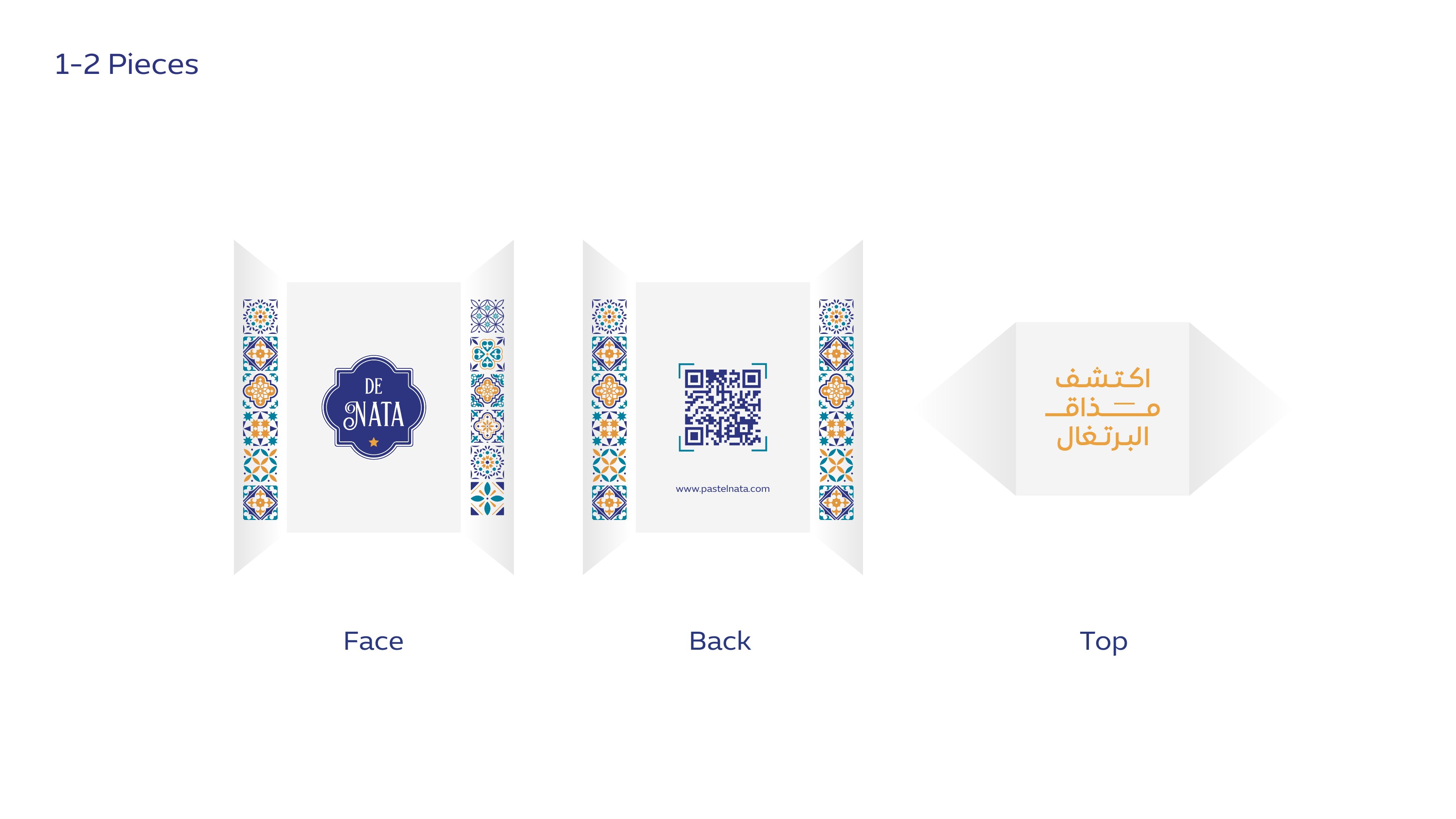
Cup Stack Mockup
Stacked in service, the tile band lines up across cups into a continuous ornament strip, the detail that makes a counter look designed rather than branded.
- Scope
- Production mockup
- Detail
- Tile band aligns across the stack
- Format
- 8oz double-wall
- Year
- 2024
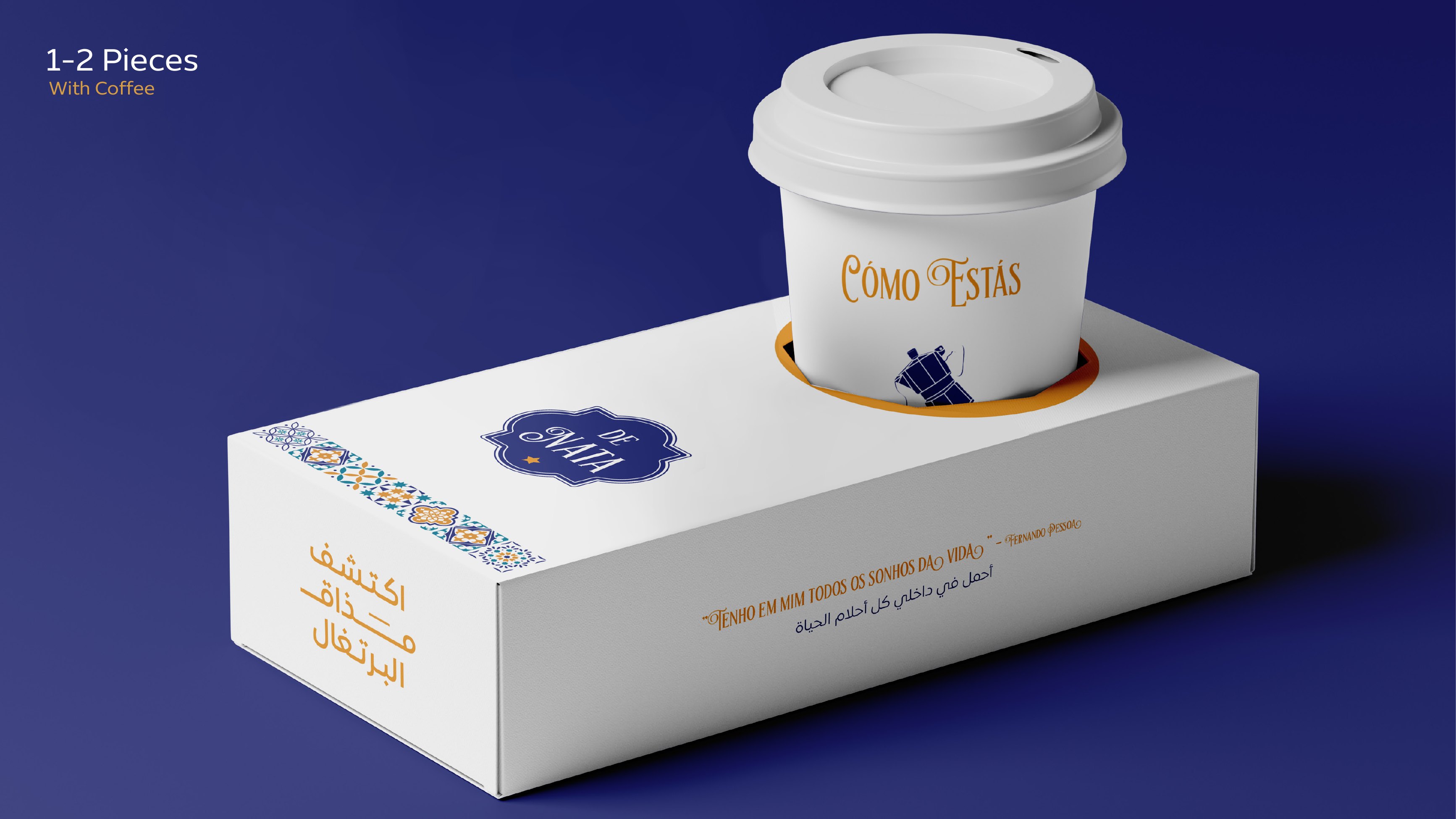
1–2 Pieces With Coffee
The smallest box in the range, engineered with a die-cut ring so a coffee cup seats directly into the lid, one hand carries pastry and drink together. A Fernando Pessoa line runs bilingually along the side.
- Scope
- Structural + graphic design
- Capacity
- 1–2 pieces + one cup
- Feature
- Die-cut cup seat in lid
- Copy
- Pessoa quote, Arabic / Portuguese
- Year
- 2024
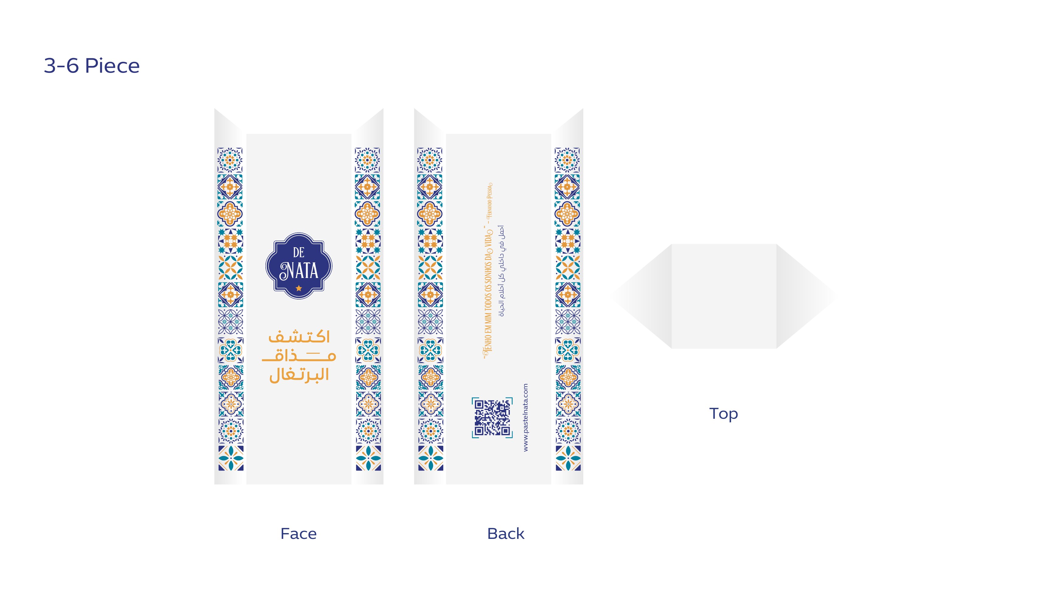
3–6 Piece Sleeve
Mid-size sleeve artwork with the tile band framing top and bottom, a QR panel on the back and the Arabic tagline set as the hero, the everyday take-away unit of the range.
- Scope
- Dieline artwork, face / back / top
- Capacity
- 3–6 pieces
- Tagline
- اكتشف مذاق البرتغال
- Year
- 2024
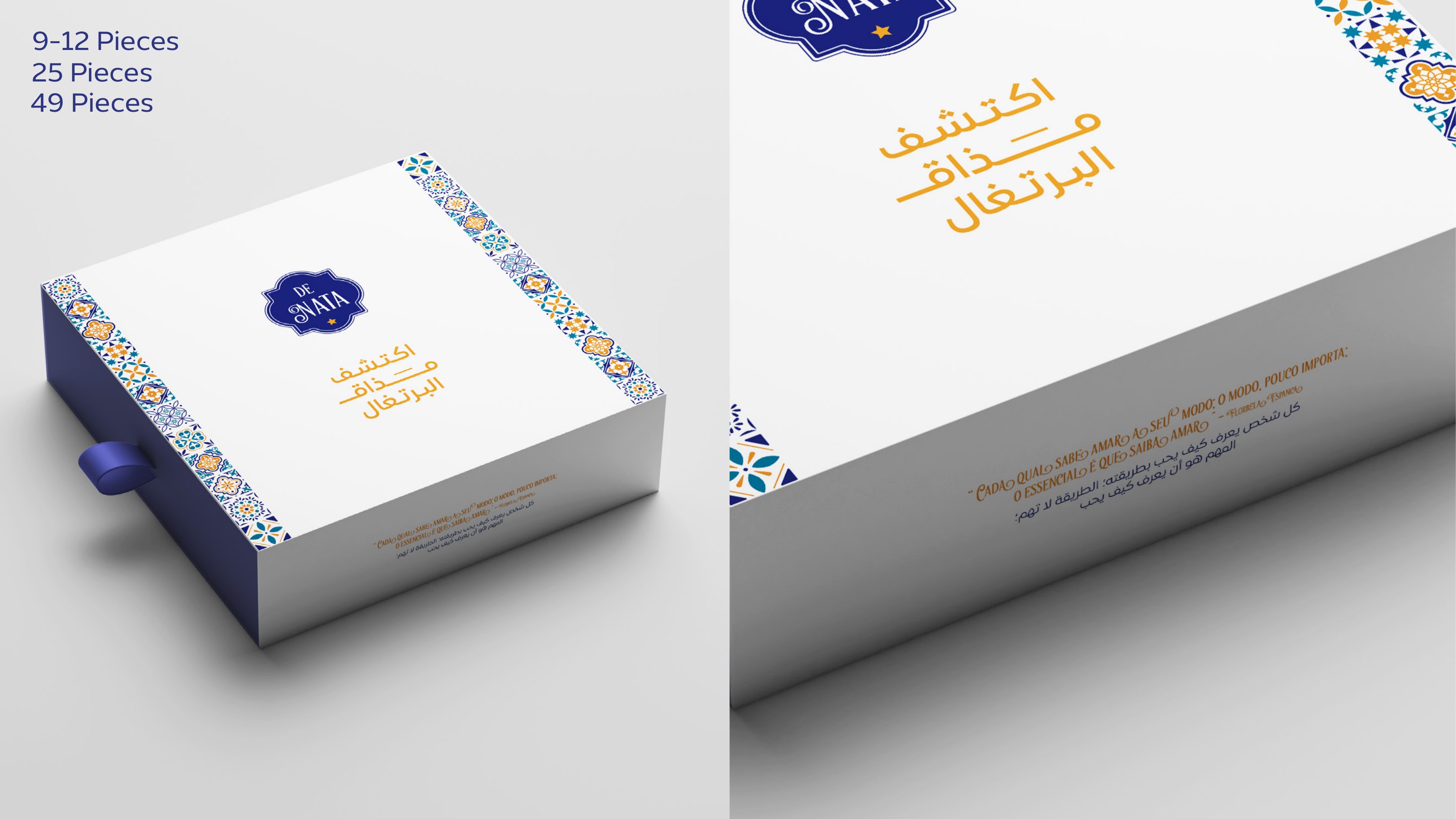
9–12 / 25 / 49 Piece Box
The gifting tier: a navy-spined drawer box with a ribbon pull, scaling across three counts without redrawing the artwork, only the tile band lengthens.
- Scope
- Drawer box system
- Counts
- 9–12 · 25 · 49 pieces
- Feature
- 1.5 cm blue ribbon pull
- Year
- 2024
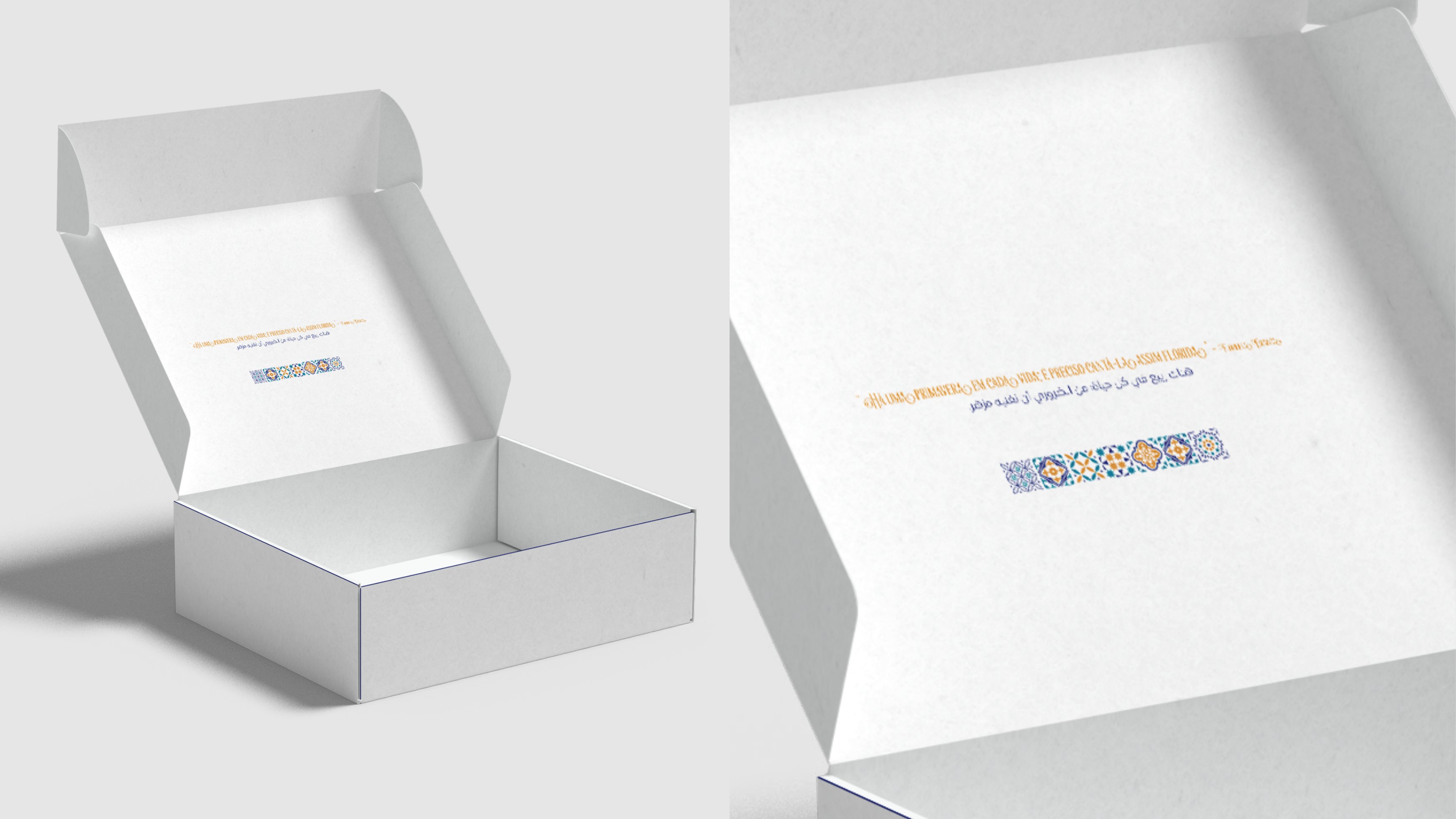
Interior Print
Inside the lid, a single bilingual line and a thin tile rule, the only ink on an otherwise white interior, so the pastries stay the loudest thing in the box.
- Scope
- Interior artwork
- Finish
- Matte white, single-colour print
- Intent
- Product-first unboxing
- Year
- 2024
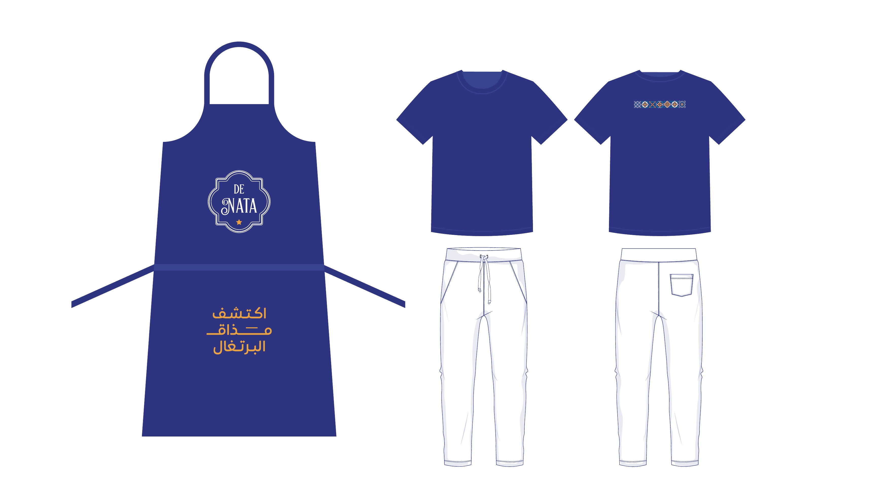
Uniform System
Navy apron with the crest at chest height and the Arabic tagline low on the skirt, paired with plain tees carrying a single tile strip at the back neck.
- Scope
- Uniform design
- Pieces
- Apron · tee · trouser
- Palette
- Lisbon navy on white
- Year
- 2024
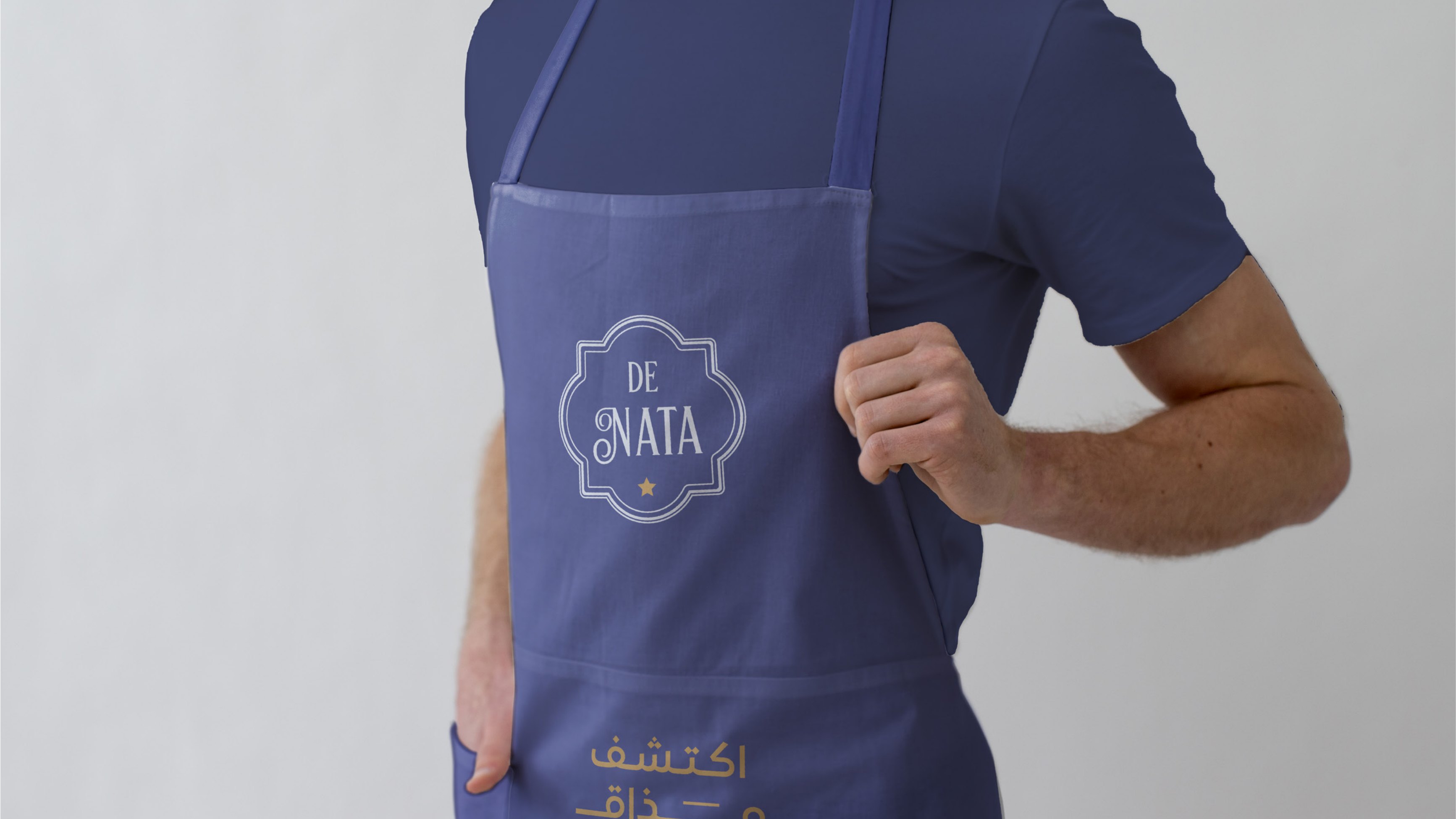
Apron in Service
Worn, the crest sits exactly where a guest looks across the counter, the mark reads at conversation distance without needing scale.
- Scope
- Application mockup
- Detail
- Crest placed at counter eye-line
- Year
- 2024
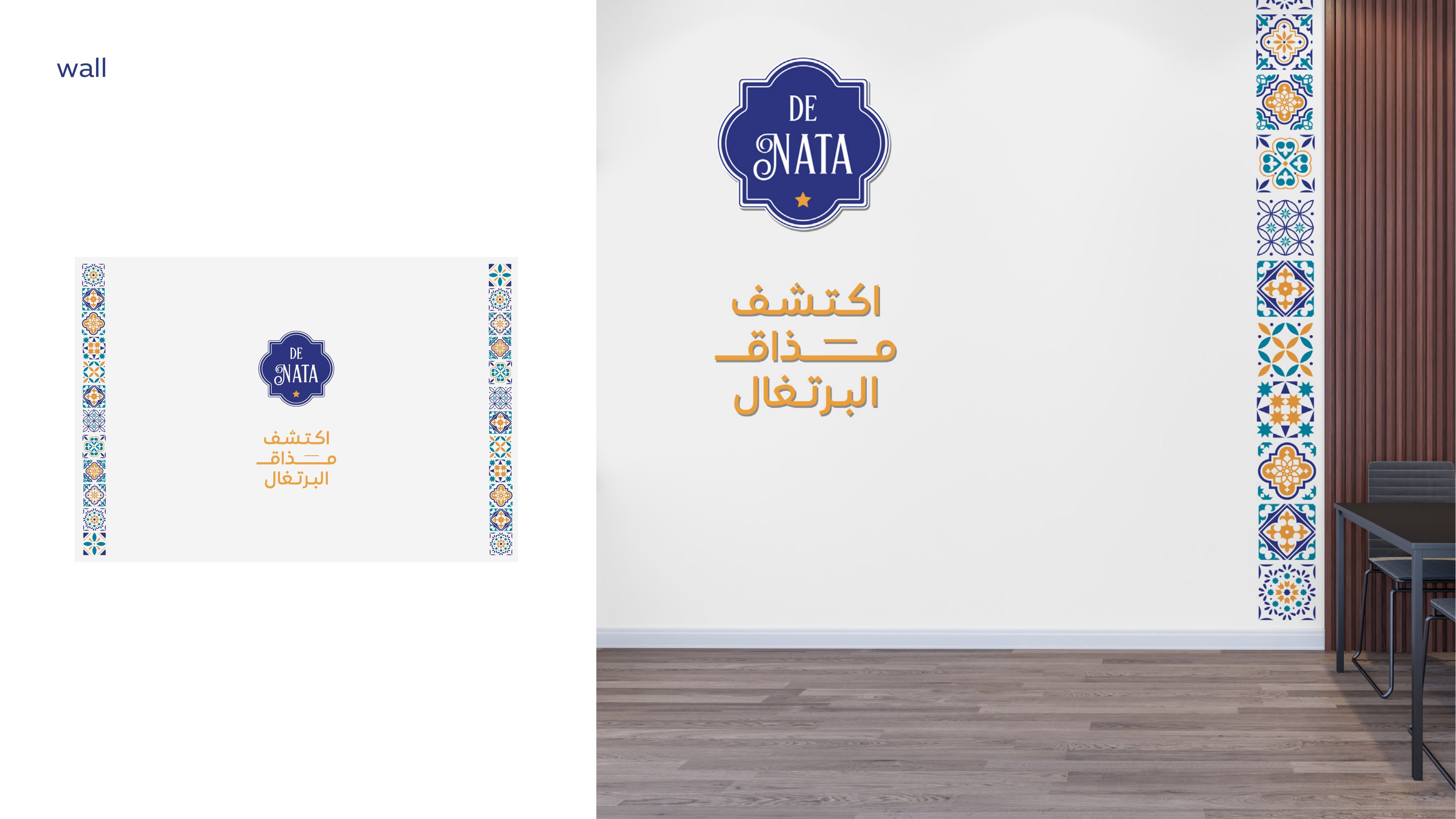
Wall Graphics
In-store: a full-height azulejo column running floor to ceiling beside the seating, with the crest and tagline held small against clean plaster so the tile does the work.
- Scope
- Environmental graphics
- Element
- Floor-to-ceiling tile column
- Contrast
- Dense ornament vs. bare wall
- Year
- 2024
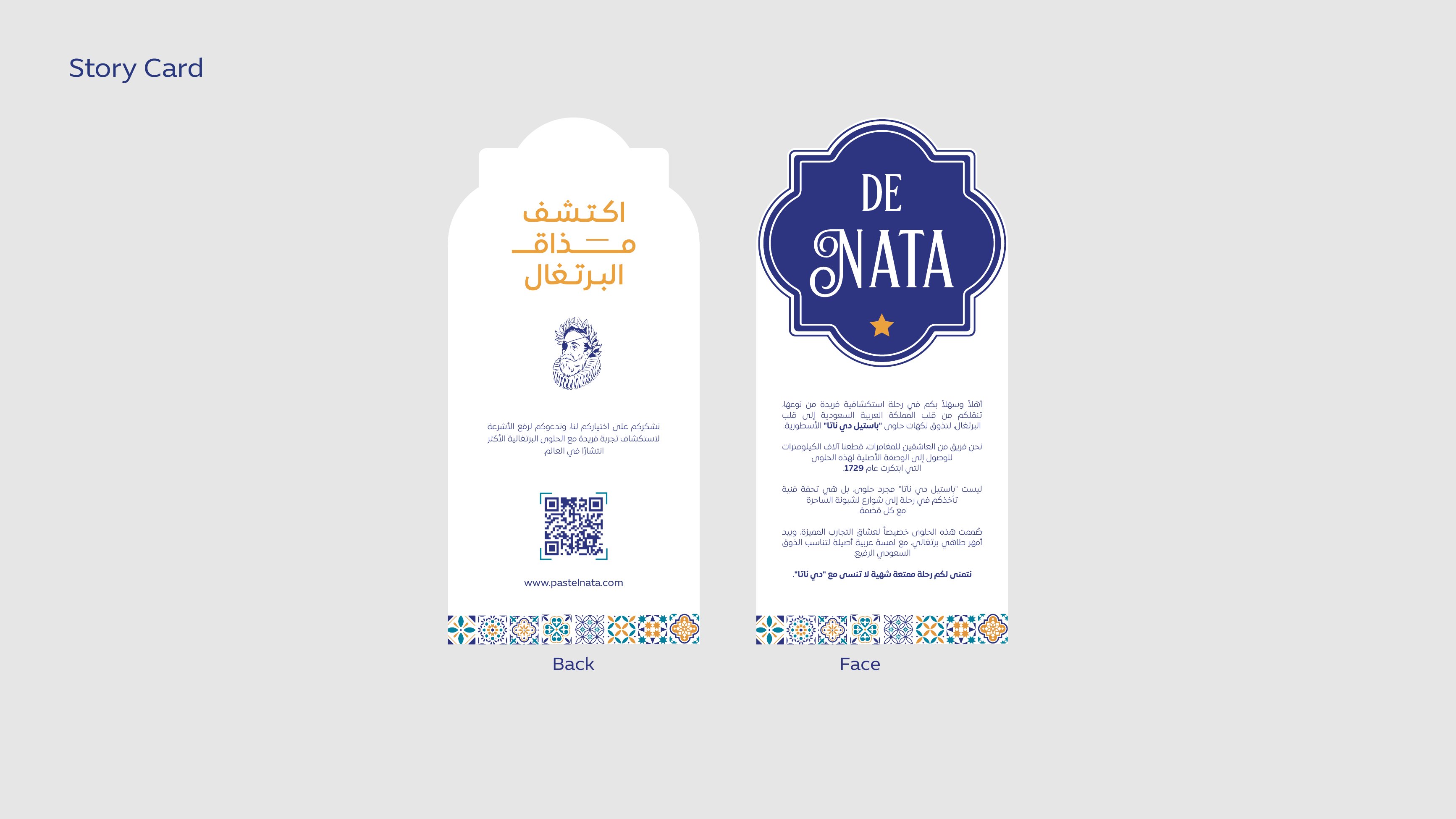
Story Card
A die-cut card shaped from the crest silhouette, telling the pastel de nata origin story in Arabic and English with a QR to the full brand page.
- Scope
- Insert card, face + back
- Shape
- Die-cut to crest silhouette
- Content
- Bilingual brand story + QR
- Year
- 2024
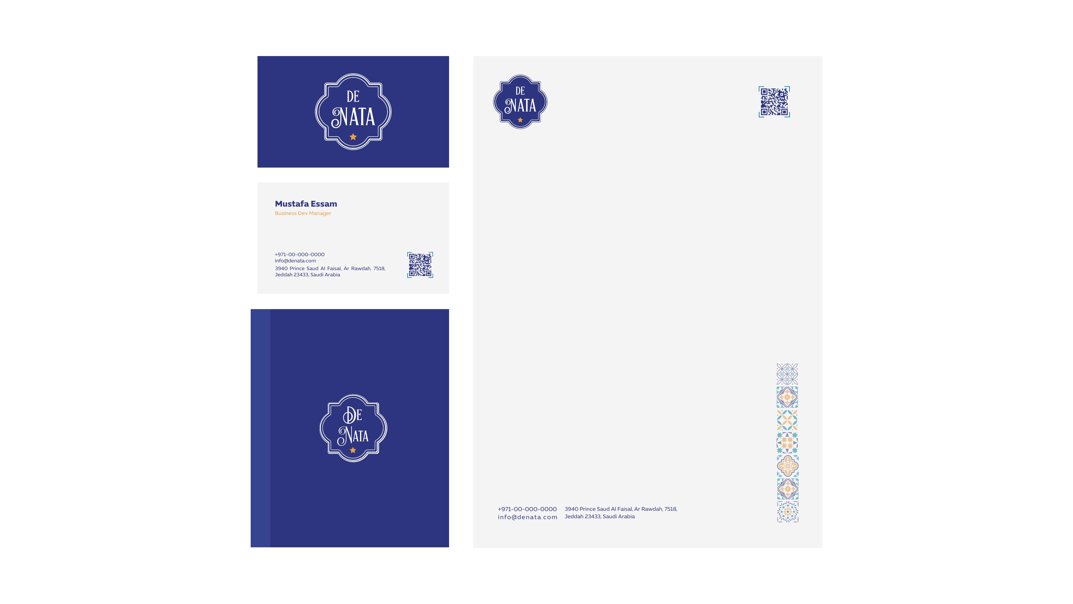
Stationery Suite
Business cards, letterhead and envelope built on one rule: navy field or white field, never both fighting. The tile motif appears once per surface.
- Scope
- Stationery system
- Items
- Card · letterhead · envelope
- Rule
- One motif per surface
- Year
- 2024
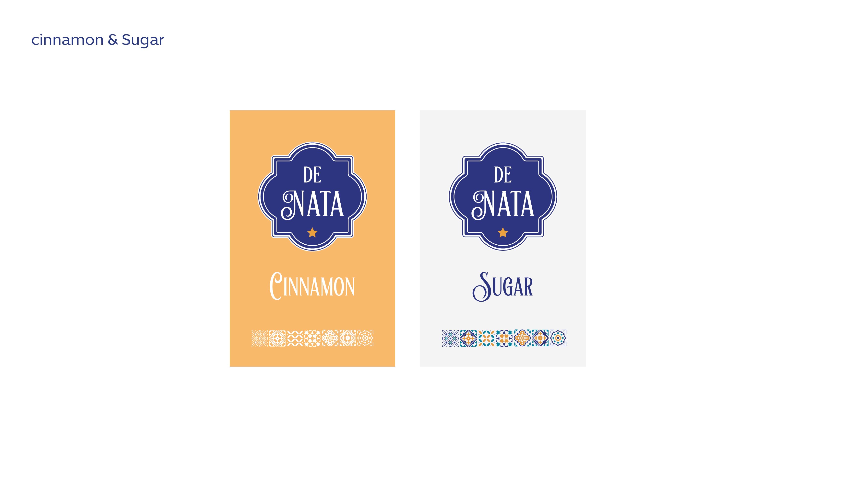
Cinnamon & Sugar Sachets
Two condiment sachets colour-coded for instant recognition, amber for cinnamon, white for sugar, with the crest held identical across both so the pair reads as a set.
- Scope
- Sachet artwork
- Variants
- Cinnamon (amber) · Sugar (white)
- System
- Colour-coded, single crest
- Year
- 2024
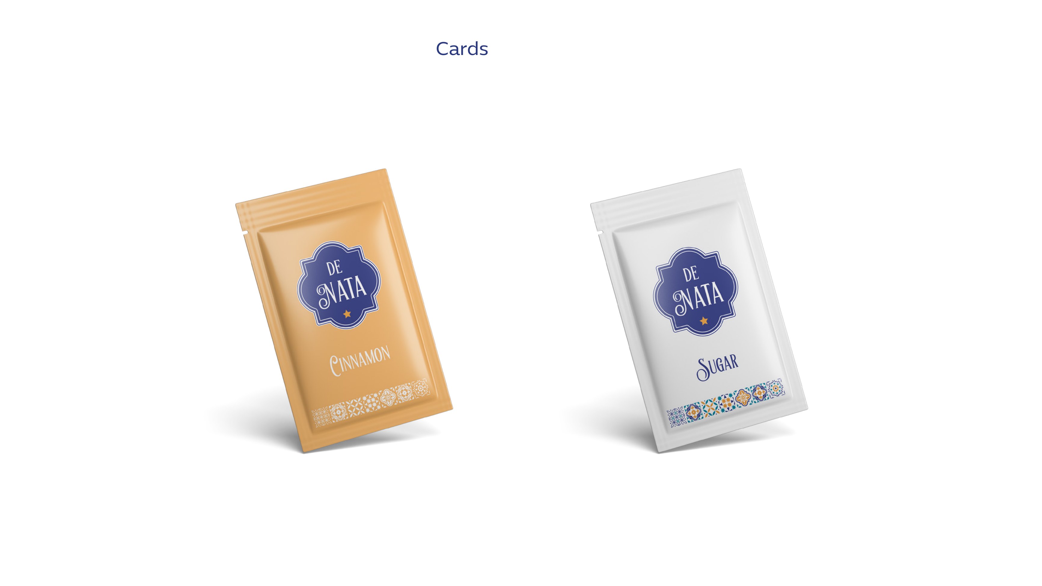
Sachets, Production
The sachets in material: matte foil laminate, crest centred, sized to sit flat on a saucer beside the cup.
- Scope
- Production mockup
- Material
- Matte foil laminate
- Year
- 2024
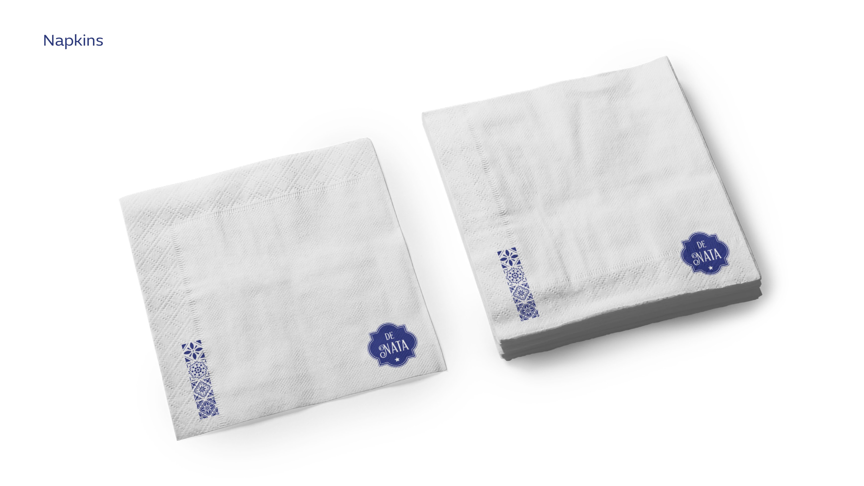
Napkins
Two-colour napkin print: a tile square in one corner, the crest in the other, so the mark shows whichever way the napkin is folded.
- Scope
- Napkin artwork
- Two-colour on tissue
- Logic
- Corner marks survive any fold
- Year
- 2024
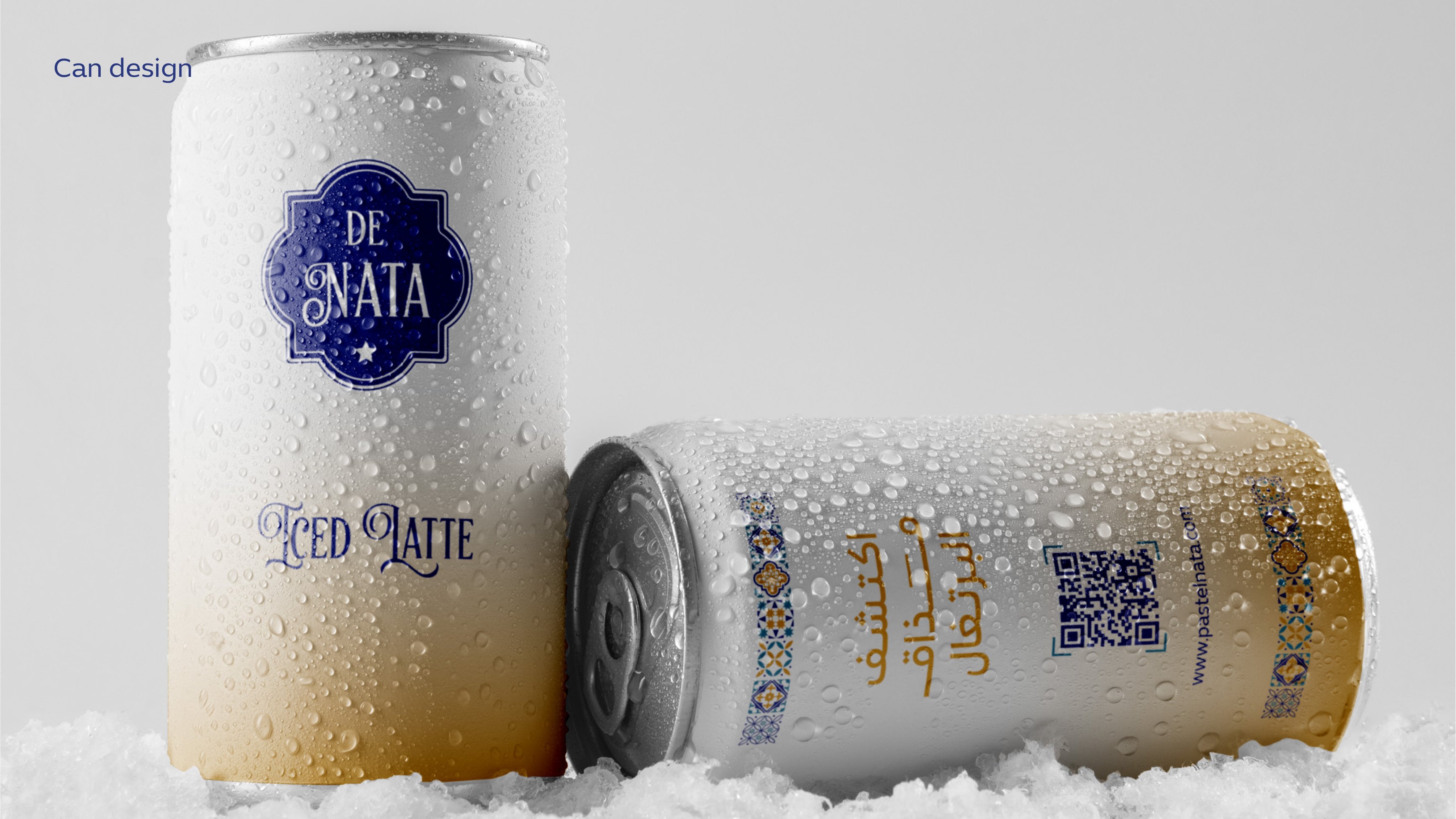
Iced Latte Can
The ready-to-drink extension, a navy-to-amber gradient sleeve with the crest at the top and a script Iced Latte lockup, designed to read cold in a chiller cabinet.
- Scope
- Can design
- Product
- Iced Latte RTD
- Graphic
- Navy → amber gradient sleeve
- Year
- 2024
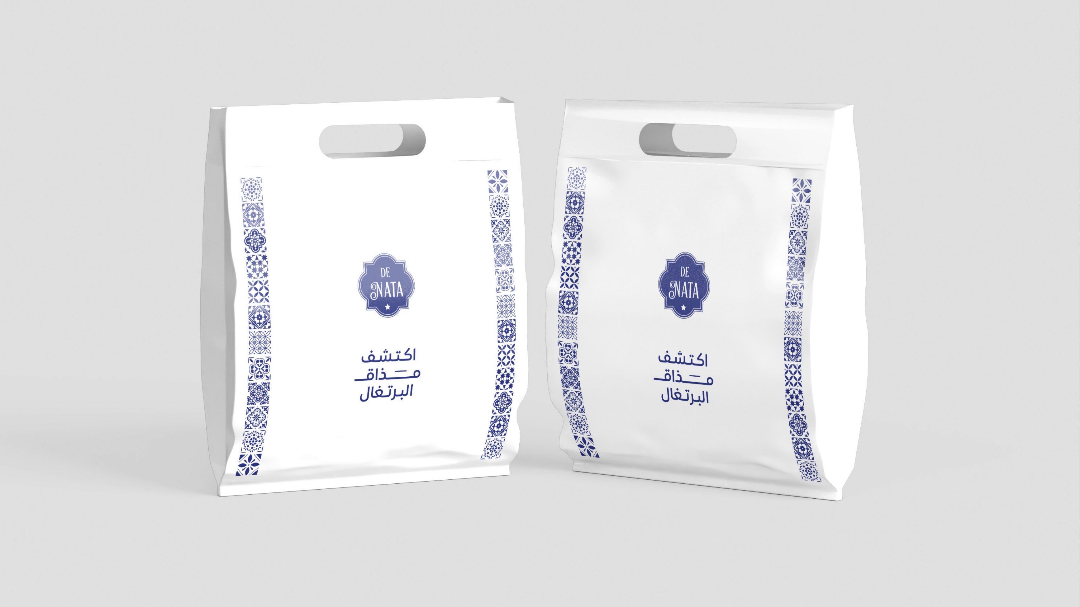
Paper Carrier Bags
Two bag sizes with the tile band running vertically down the gusset, from the side the bag is pure ornament, from the front it is a clean white crest.
- Scope
- Carrier bag design
- Sizes
- Two formats
- Detail
- Vertical tile band on gusset
- Year
- 2024
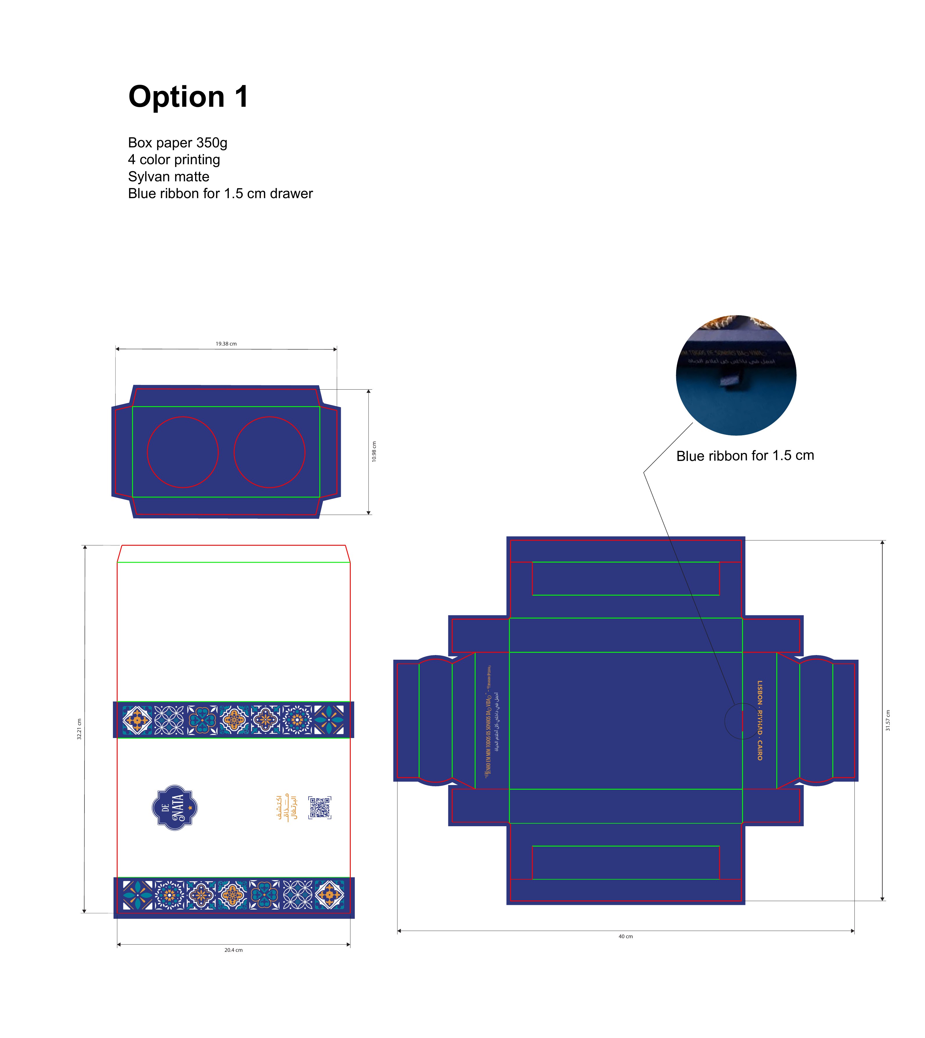
New Box, Option 1
First production dieline for the revised box: a 20.4 × 32.21 cm wrap with a two-piece structure, tile bands top and bottom, and a ribbon pull for the drawer.
- Scope
- Structural dieline
- Material
- 350g box paper, Sylvan matte
- 4-colour
- Detail
- 1.5 cm blue ribbon drawer pull
- Year
- 2026
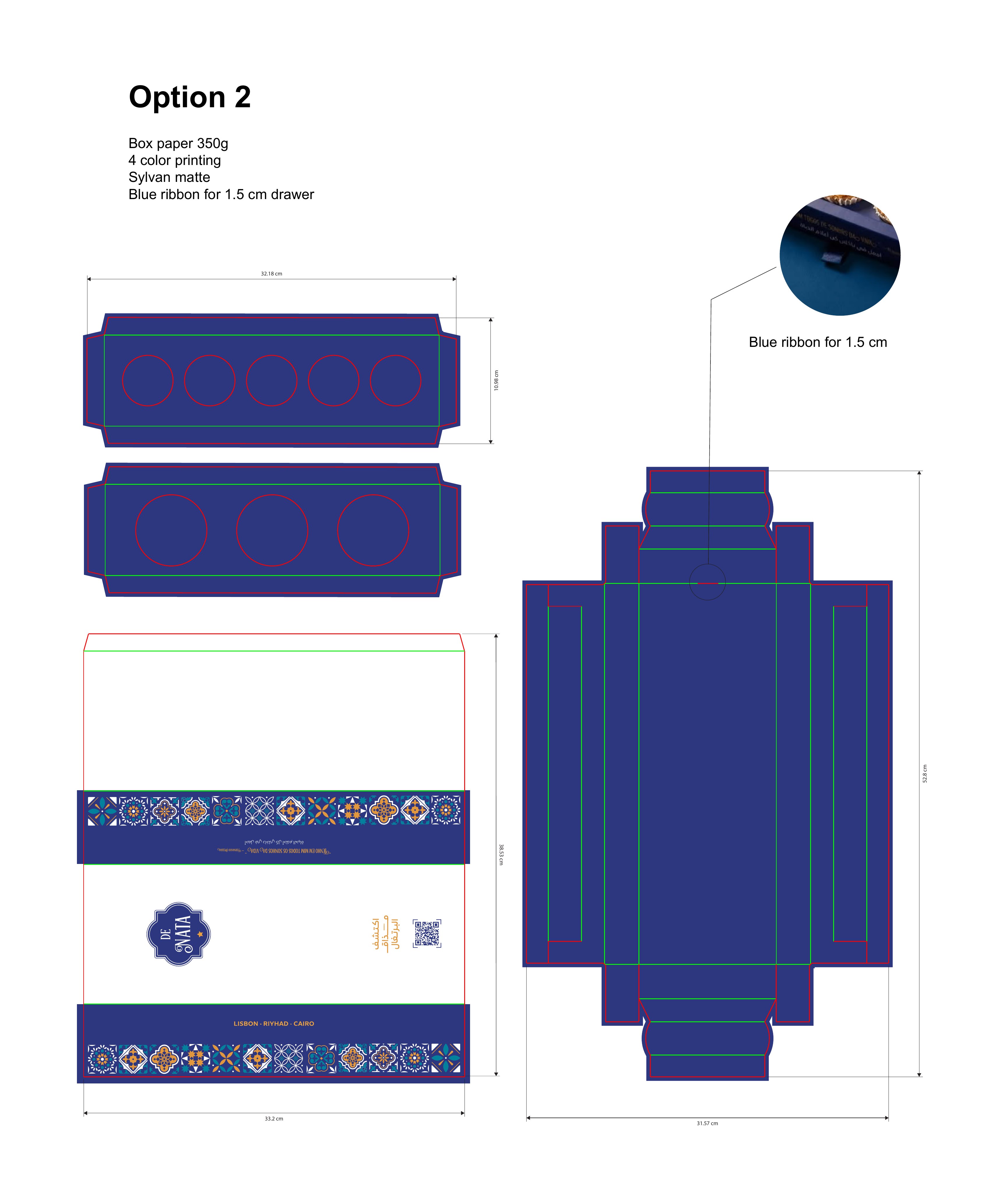
New Box, Option 2
A deeper two-tray variant for double-layer service, keeping the same wrap graphics so both options can run off one artwork set.
- Scope
- Structural dieline
- Structure
- Two stacked trays
- Material
- 350g box paper, Sylvan matte
- Detail
- 1.5 cm blue ribbon drawer pull
- Year
- 2026
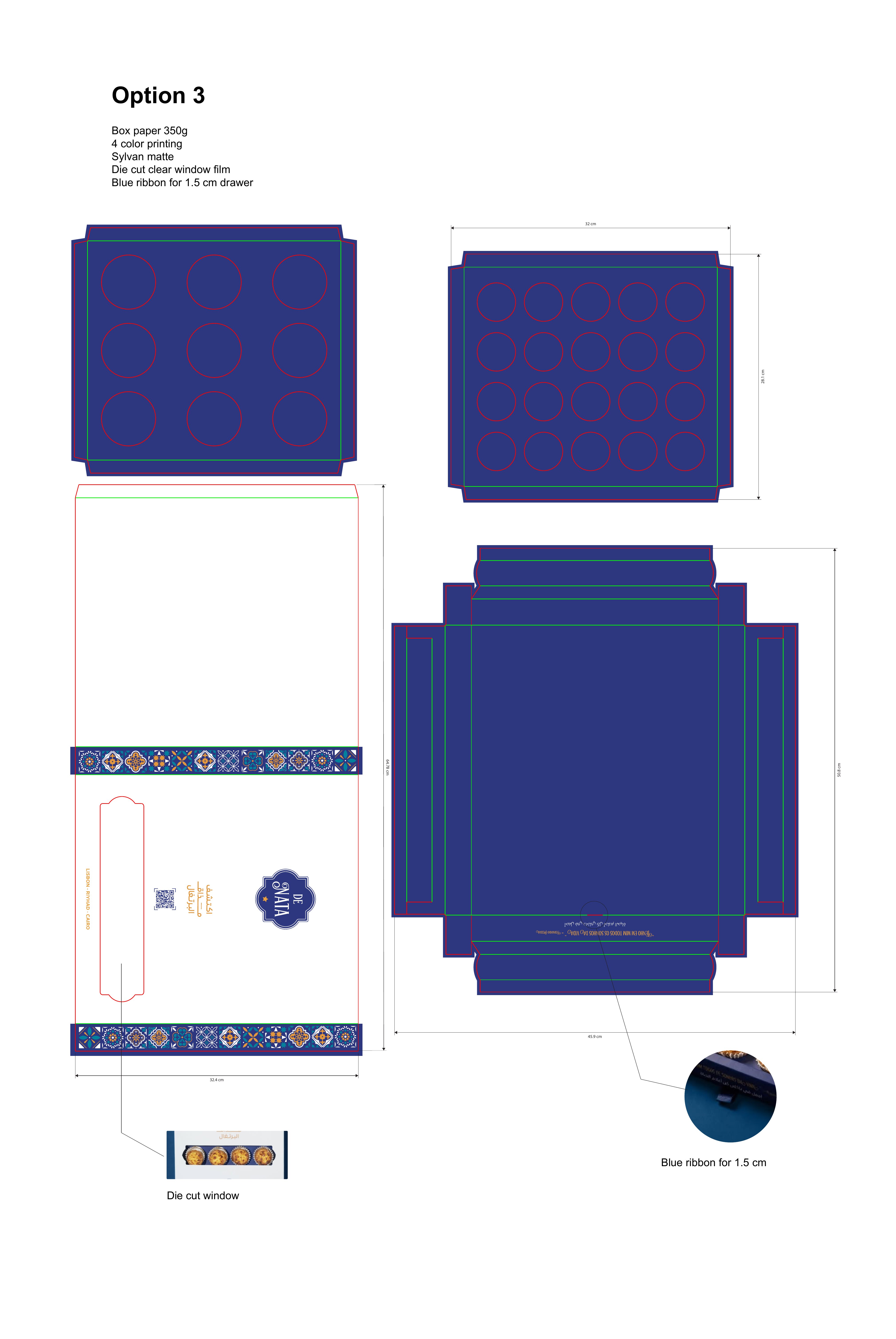
New Box, Option 3
The window edition: a die-cut aperture with clear film over a 12-piece tray, so the product itself becomes the graphic on the lid.
- Scope
- Structural dieline
- Feature
- Die-cut clear window film
- Material
- 350g box paper, Sylvan matte
- Capacity
- 12-piece tray
- Year
- 2026
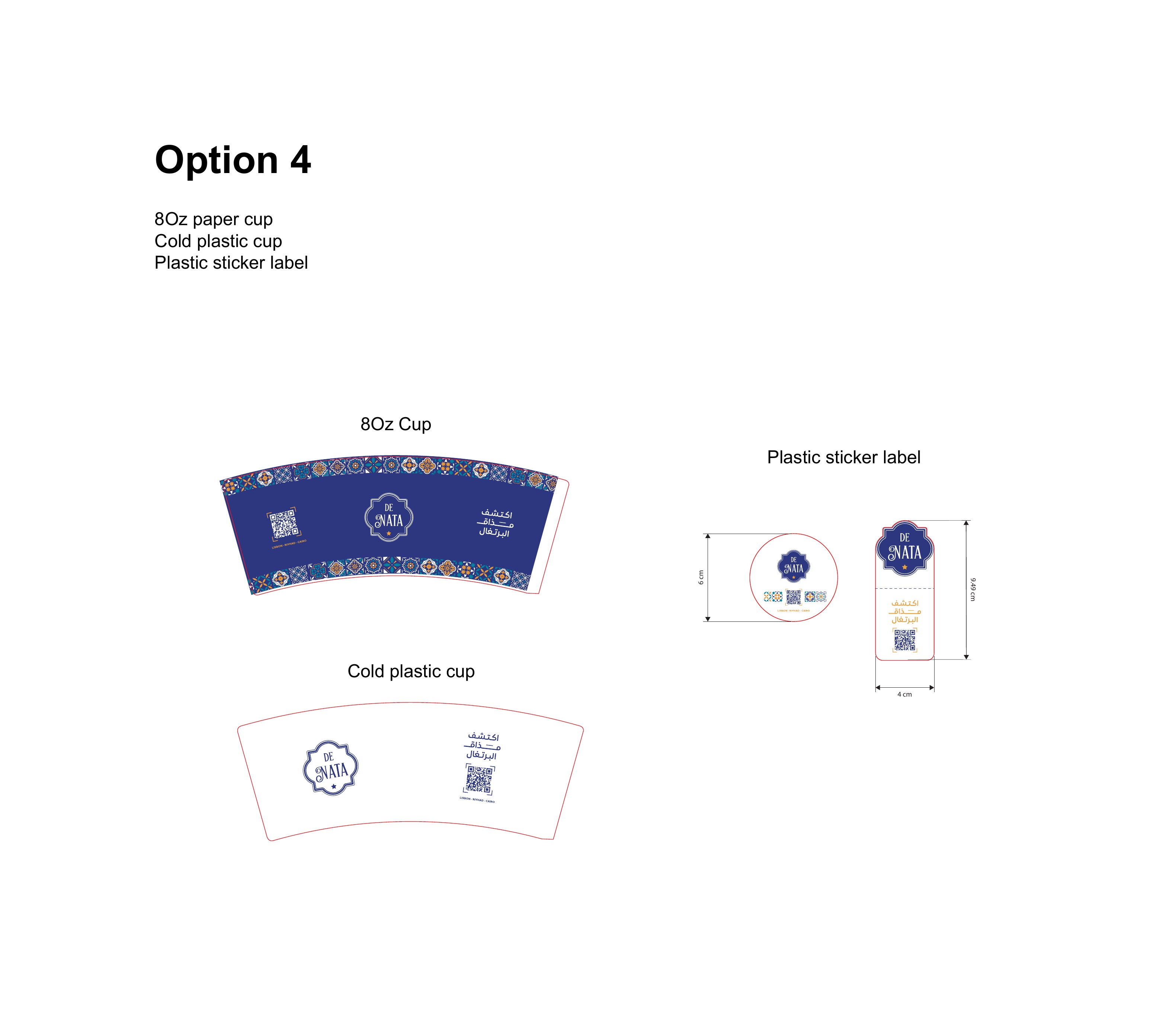
New Box, Option 4 (Cups & Labels)
Beverage artwork issued with the box release: 8oz paper cup wrap, cold plastic cup wrap and the round plastic sticker label used to seal both.
- Scope
- Cup wraps + seal label
- Items
- 8oz paper cup · cold cup · sticker
- 4-colour
- Year
- 2026
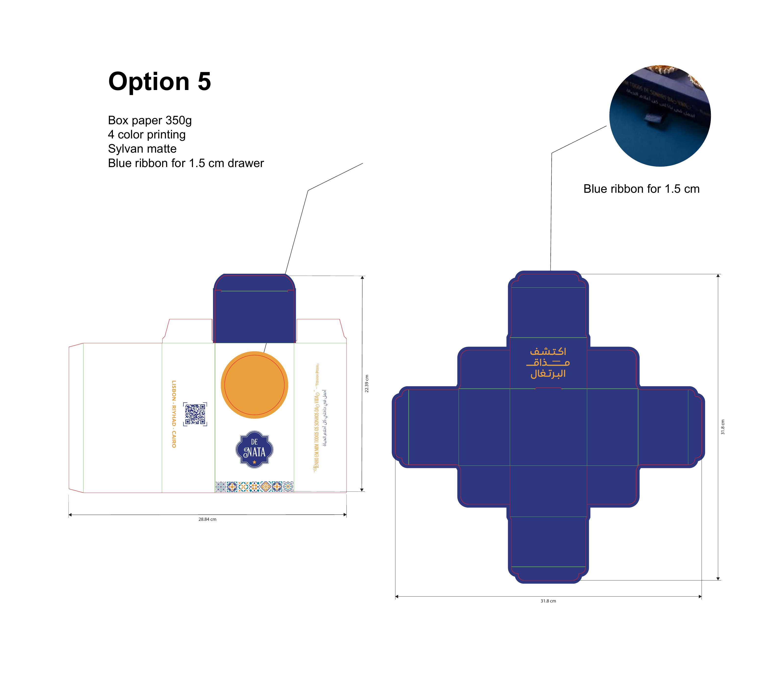
New Box, Option 5
The compact single-serve carton, an amber disc on the face, navy shoulders and a cross-shaped dieline that folds without glue on the top flap.
- Scope
- Structural dieline
- Format
- Single-serve carton
- Material
- 350g box paper, Sylvan matte
- Detail
- 1.5 cm blue ribbon pull
- Year
- 2026
All projects
View all workReady to build your next brand?.
Let's create something remarkable.