Gontran Cherrier
A French bakery that brands the white space.
A full brand world for a fourth-generation baker, one stamp, one yellow, and a hand-brushed voice carried from bread bag to storefront wall.
- Sector
- Bakery & pâtisserie
- Services
- Identity, packaging, retail graphics, tone of voice
- Palette
- White · Pantone 123 C · Black
- Year
- 2026
Challenge
An artisan Parisian name expanding into international retail needed a system that stayed craft-led at scale, without turning into a franchise template.
Approach
The G.C roundel treated as a movable stamp, rotated, cropped, oversized, over untouched white stock, paired with a library of custom brush lines instead of a script font.
Outcome
Packaging, retail graphics and campaign photography that all read as the same bakery, from a paper bag in the hand to a wall at the end of a mall.
Selected outputs
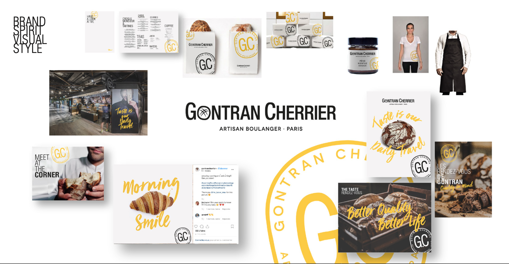
Brand Spirit & Visual Style
The full visual world, logo lock-up, menus, packaging, uniforms, jars and social, held together by one stamp and one yellow.
- Scope
- Identity system, brand guidelines
- Applications
- Menus, uniform, retail, social
- Mark
- G.C artisan boulanger stamp, Paris
- Year
- 2026
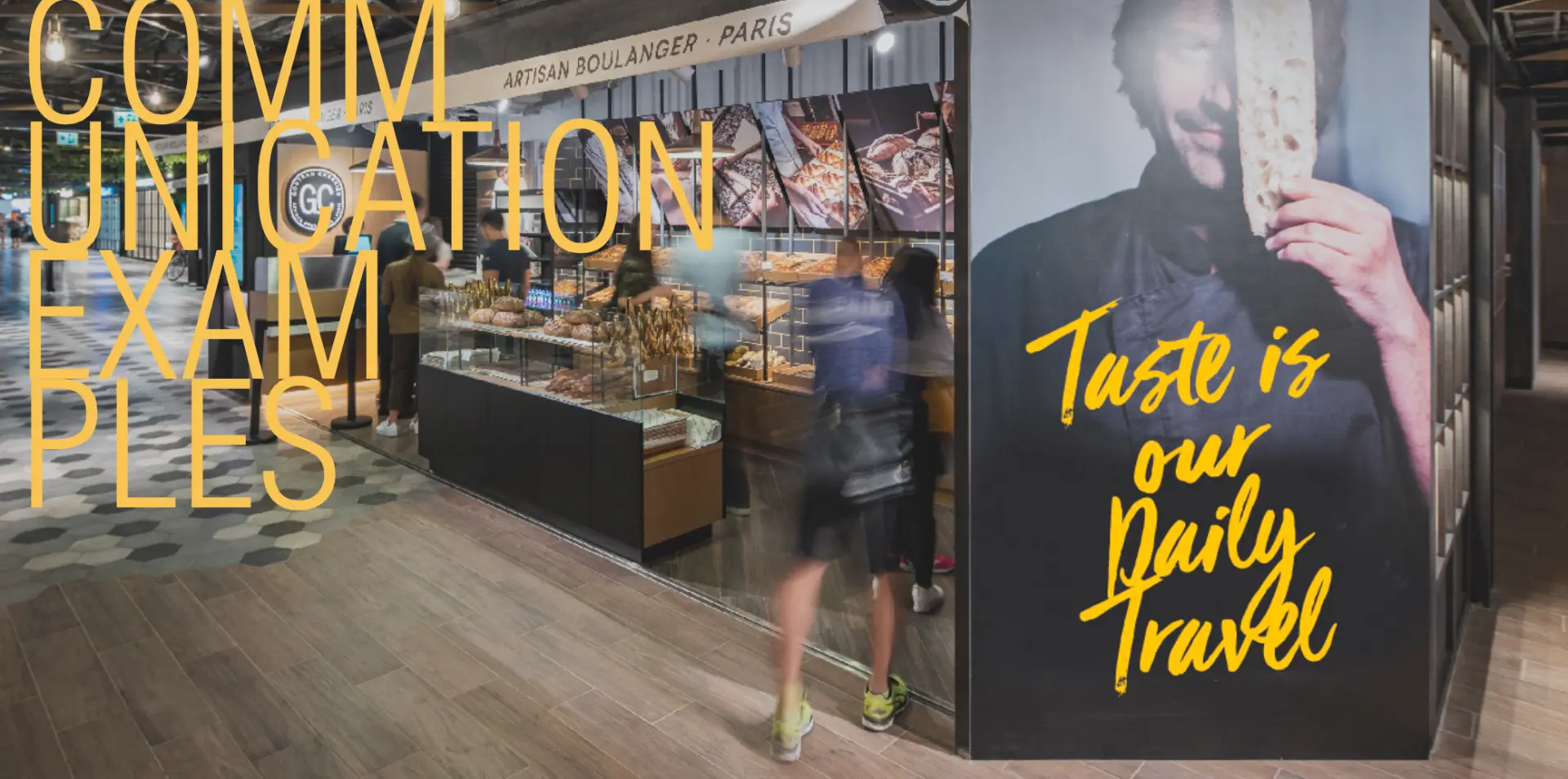
In-Store Communication
Retail communication examples, oversized brush-script campaign walls facing the counter, tuned to be read at walking pace.
- Scope
- Retail graphics, campaign walls
- Application
- Storefront, counter, façade signage
- Detail
- 'Taste is our Daily Travel' key line
- Year
- 2026
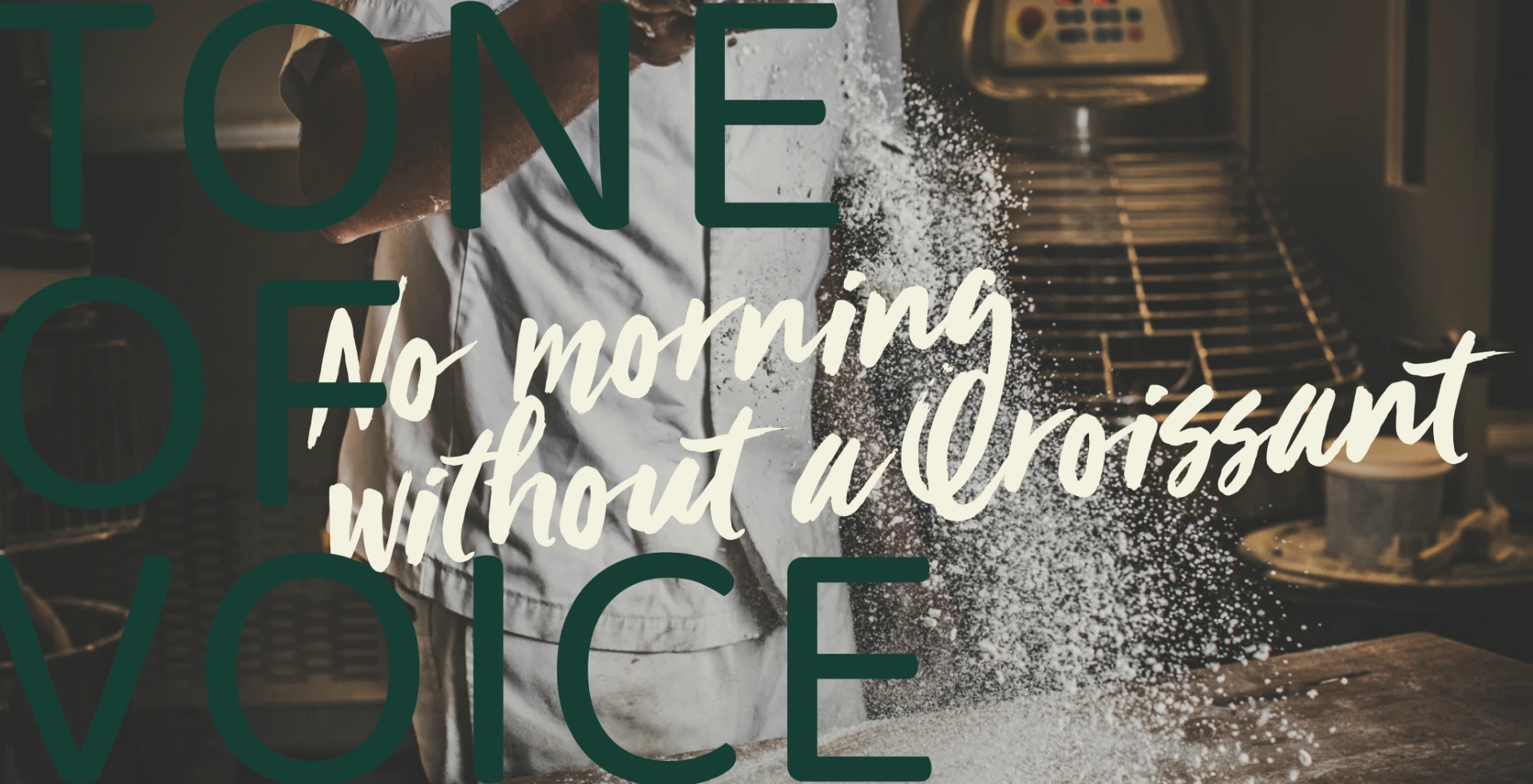
Tone of Voice
Voice expressed visually, deep green display type over documentary bakery photography, cut through with handwritten brand lines.
- Scope
- Tone of voice, campaign art direction
- Palette
- Forest green, cream, warm bakery light
- Line
- 'No morning without a Croissant'
- Year
- 2026
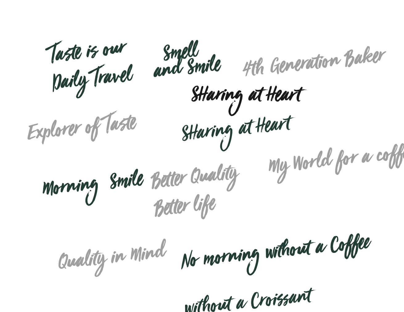
Brush Lettering Library
A library of hand-brushed brand lines drawn as artwork, so every campaign speaks in the same hand instead of a font.
- Scope
- Custom lettering, copy system
- Lines
- Smell and Smile, Sharing at Heart, Morning Smile
- Use
- Packaging, posters, social, in-store
- Year
- 2026
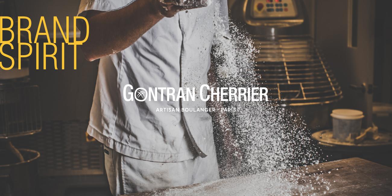
Brand Spirit, Cover
The opening page sets the tone before a single rule is read: flour in the air, hands in the dough. The brand spirit book was built to be felt as a bakery first and a manual second.
- Chapter
- Introduction
- Format
- Landscape brand spirit book, 29 pages
- Role
- Briefing platform for all brand actions
- Year
- 2026
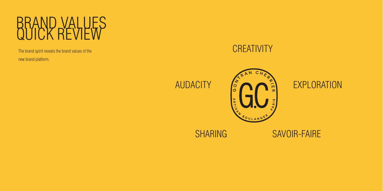
Brand Values
Five values orbit the G.C stamp, creativity, audacity, exploration, sharing and savoir-faire. Every later decision in the book is traced back to one of them, so the visual world argues from values rather than taste.
- Chapter
- Introduction
- Values
- Creativity · Audacity · Exploration · Sharing · Savoir-faire
- Use
- Filter for campaign and product briefs
- Year
- 2026
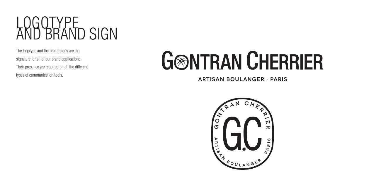
Logotype & Brand Sign
Two signatures do all the work: the horizontal Gontran Cherrier logotype for authorship, and the circular G.C artisan boulanger stamp for craft. One of them is required on every piece the brand puts into the world.
- Chapter
- The tool kit
- Marks
- Wordmark lock-up + G.C roundel stamp
- Rule
- Signature required on all communication tools
- Year
- 2026
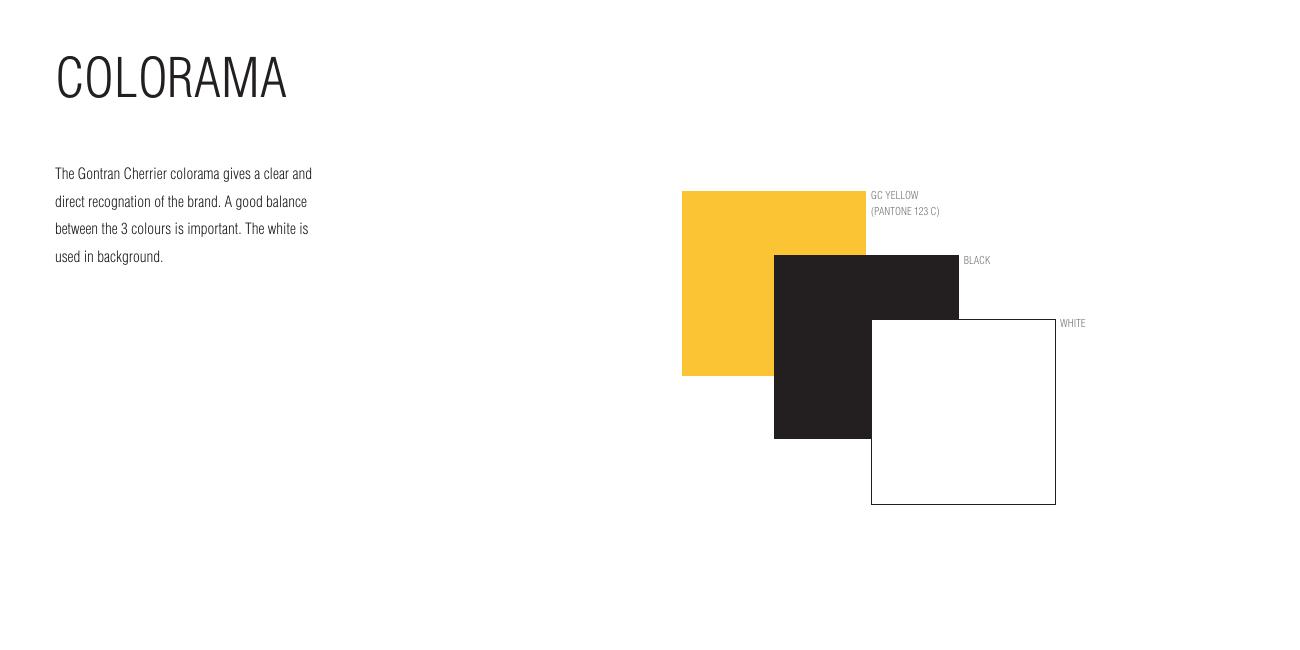
Colorama
Three colours, one balance. GC Yellow (Pantone 123 C) signals, black structures, and white is never decoration, it is the background that gives the bakery its air.
- Chapter
- The tool kit
- Primary
- GC Yellow, Pantone 123 C
- Support
- Black, white background
- Rule
- Balance the three; white always dominates
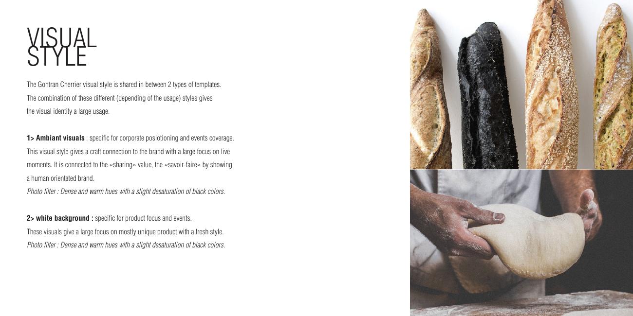
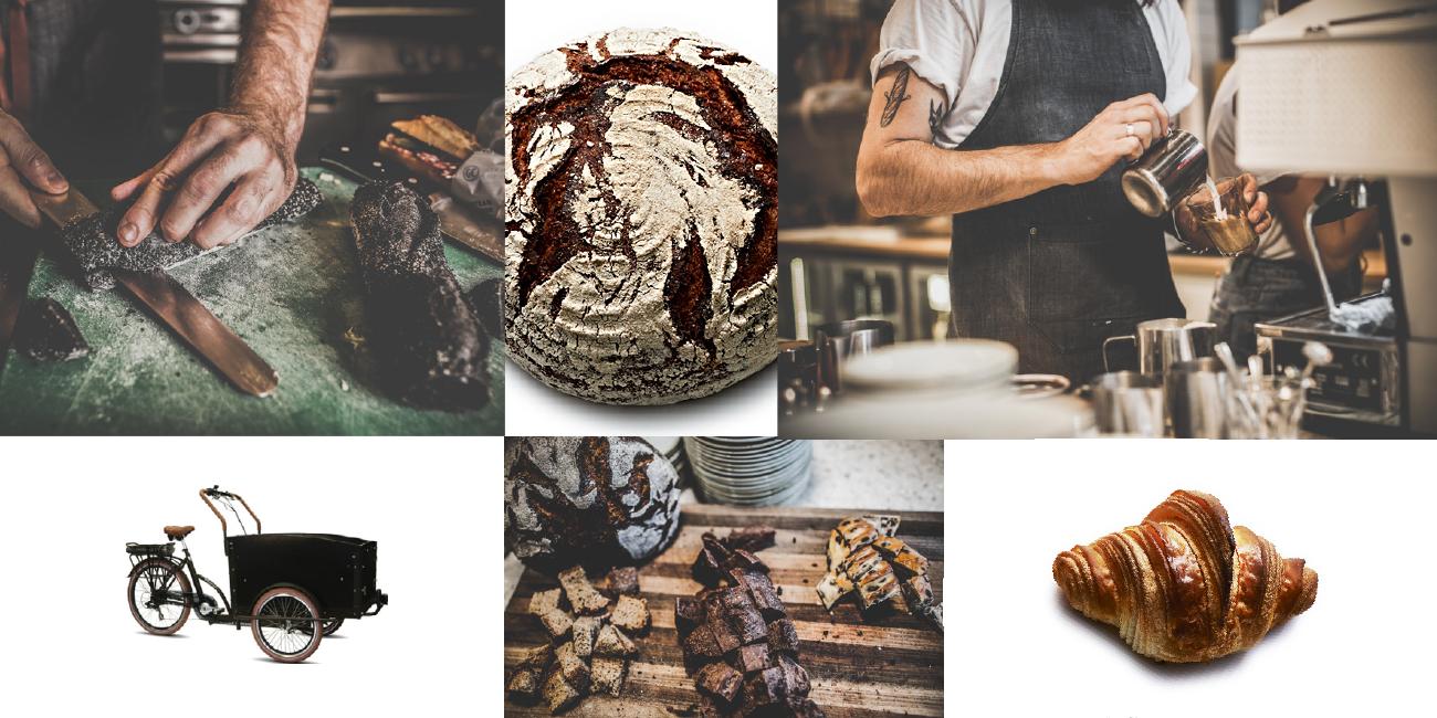
Visual Style, Two Templates
Photography splits in two. Ambient visuals cover live moments and savoir-faire with dense, warm hues; white-background visuals isolate a single product with a fresh, clean read. Same filter, two jobs.
- Chapter
- The tool kit
- Style 1
- Ambient, corporate positioning, events, craft
- Style 2
- White background, product focus
- Filter
- Dense warm hues, slightly desaturated blacks
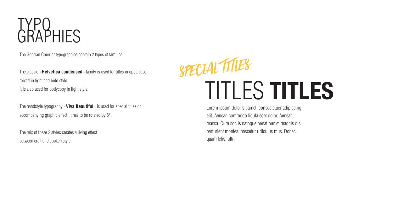
Typographies
A condensed Helvetica family carries titles in uppercase and body copy in light, the corporate spine. Viva Beautiful, a handstyle, is reserved for special titles and accompanying words so the warmth never becomes noise.
- Chapter
- The tool kit
- Primary
- Helvetica Condensed, light & bold
- Accent
- Viva Beautiful handstyle
- Rule
- Handstyle only for special titles and accents
Tone of Voice, Key Line
'No morning without a Croissant', written by hand across a portrait of the baker himself. The voice is first-person, playful and French, and it always sits on a real moment rather than a stock scene.
- Chapter
- Tone of voice
- Key line
- No morning without a Croissant
- Register
- Personal, playful, craft-proud
- Year
- 2026
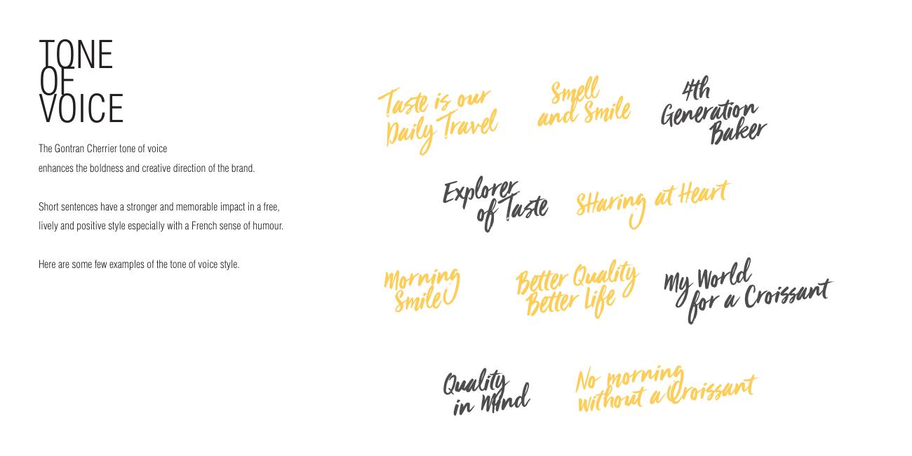
The Line Library
A written vocabulary the brand can pull from: Taste is our Daily Travel, Smell and Smile, Sharing at Heart, Quality on Wheat. Each line is drawn as artwork, so the brand always speaks in the same hand.
- Chapter
- Tone of voice
- Lines
- Explorer of Taste · Sharing at Heart · Morning Smile
- Format
- Hand-brushed lettering artwork
- Use
- Packaging, posters, social, in-store
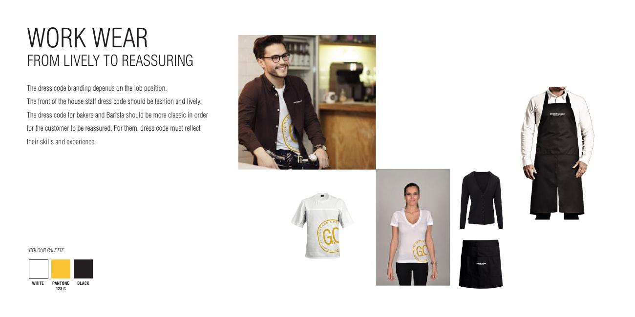
Work Wear
From lively to reassuring: tees and aprons for the front of house, denser black and stamp-led pieces for the bakers. The team becomes the first, most credible piece of signage in the shop.
- Chapter
- The examples
- Range
- T-shirts, aprons, caps, baker whites
- Logic
- Lively for counter, reassuring for craft roles
- Palette
- White · Yellow · Black
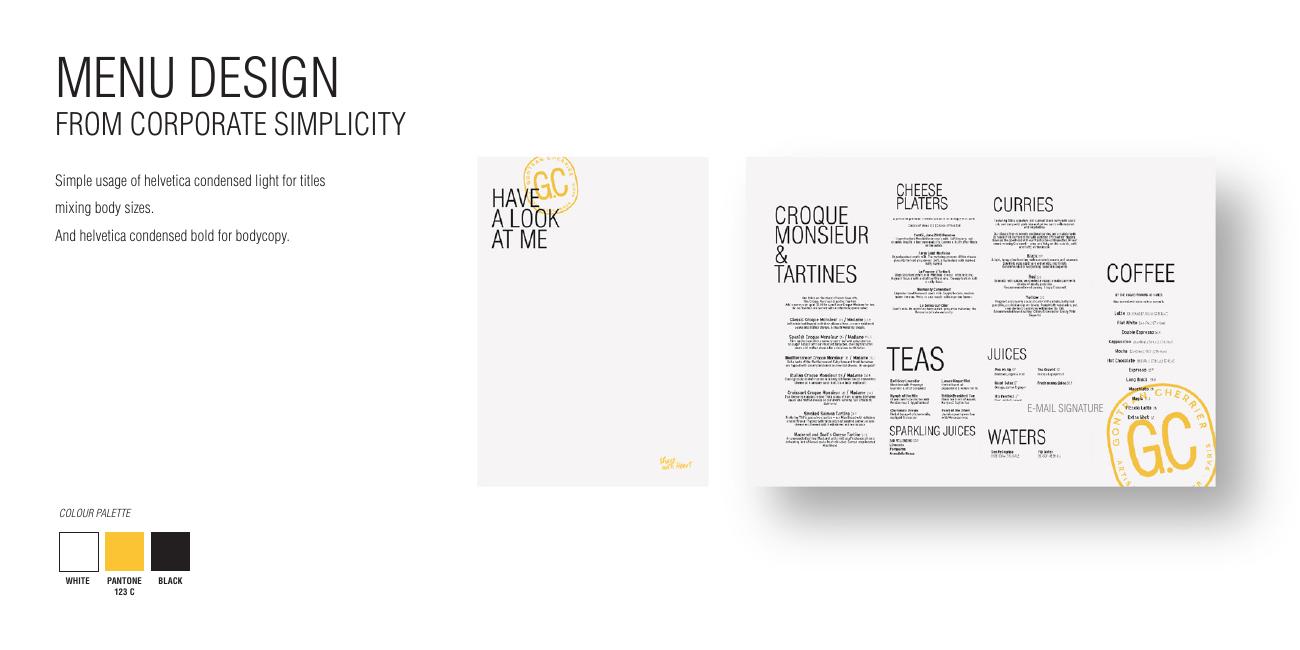
Menu Design
Corporate simplicity as an editorial layout, a strict typographic grid, generous white space, and one handwritten line at the top to keep it human.
- Chapter
- The examples
- Approach
- From corporate simplicity to living body copy
- Type
- Helvetica Condensed with handstyle titles
- Year
- 2026
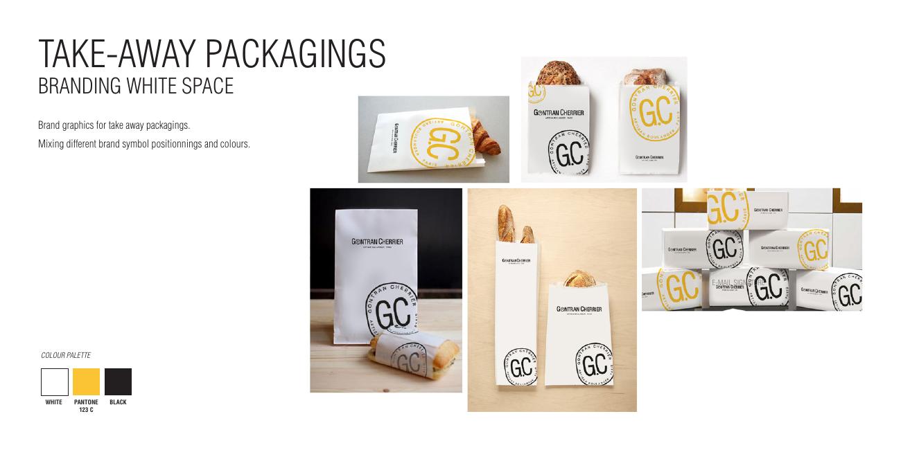
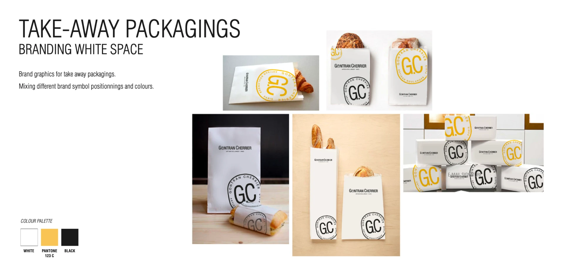
Take-Away Packagings
Branding the white space: bags, wraps and boxes where the stamp is rotated, cropped or oversized so no two formats feel copy-pasted, yet the shelf reads as one bakery.
- Chapter
- The examples
- Range
- Bread bags, sandwich wraps, pastry boxes, cups
- Principle
- Mixed symbol placement over untouched white
- Palette
- White · Pantone 123 C · Black
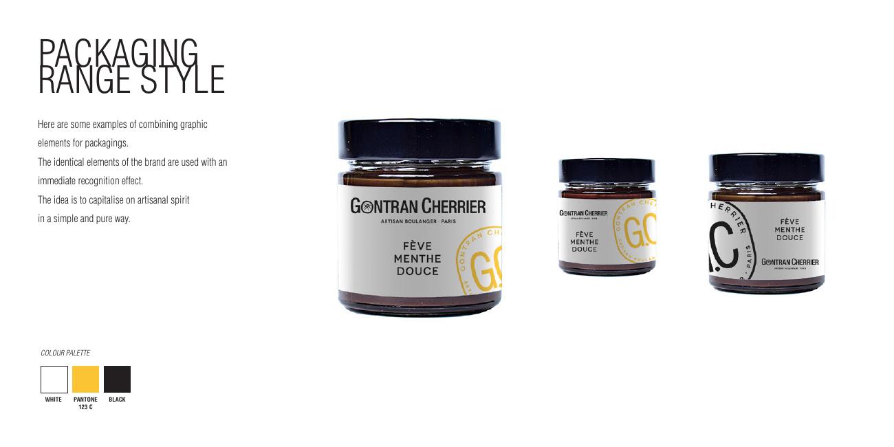
Packaging Range Style
The retail range, spreads and preserves, uses the same graphic elements at a smaller, quieter scale. The label stays immediate on shelf and still belongs to the bakery it came from.
- Chapter
- The examples
- Range
- Jars, spreads, preserves
- Rule
- Same elements, immediate recognition at small scale
- Year
- 2026
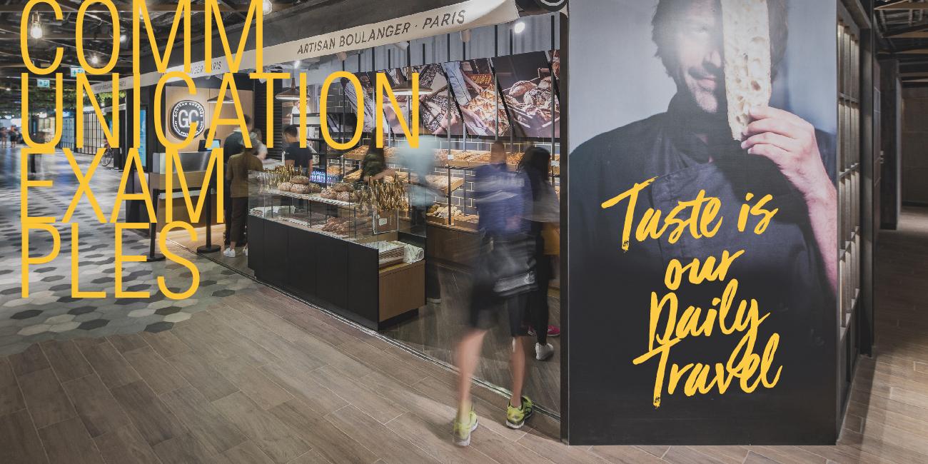
Communication Examples
In-store and façade communication where the handwritten line becomes architecture, 'Taste is our Daily Travel' painted large enough to be read at walking pace from across the mall.
- Chapter
- The examples
- Application
- Storefront, campaign wall, façade
- Key line
- Taste is our Daily Travel
- Year
- 2026
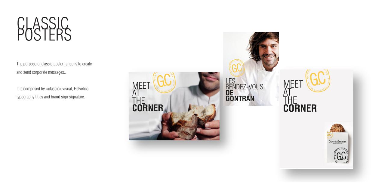
Poster System
Two poster types. Type 1 puts atmosphere first, documentary photography with typography and mark layered on top. Type 2 flips it: a handwritten line on flat colour with the product cut out beside it.
- Chapter
- The examples
- Type 1
- Photography-led, mark and typo overlay
- Type 2
- Handstyle line on background colour + product
- Use
- Windows, in-store, seasonal campaigns
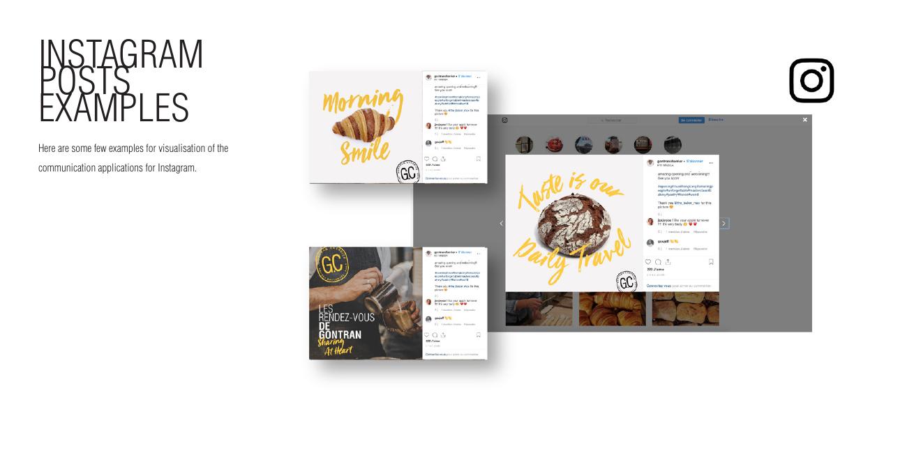
Instagram Examples
The feed is treated as a grid, not a stream: alternating ambient and white-background frames, one handwritten line per post, so the profile page itself reads as a piece of brand design.
- Chapter
- The examples
- Channel
- Instagram grid and stories
- Rhythm
- Alternating ambient / product frames
- Year
- 2026
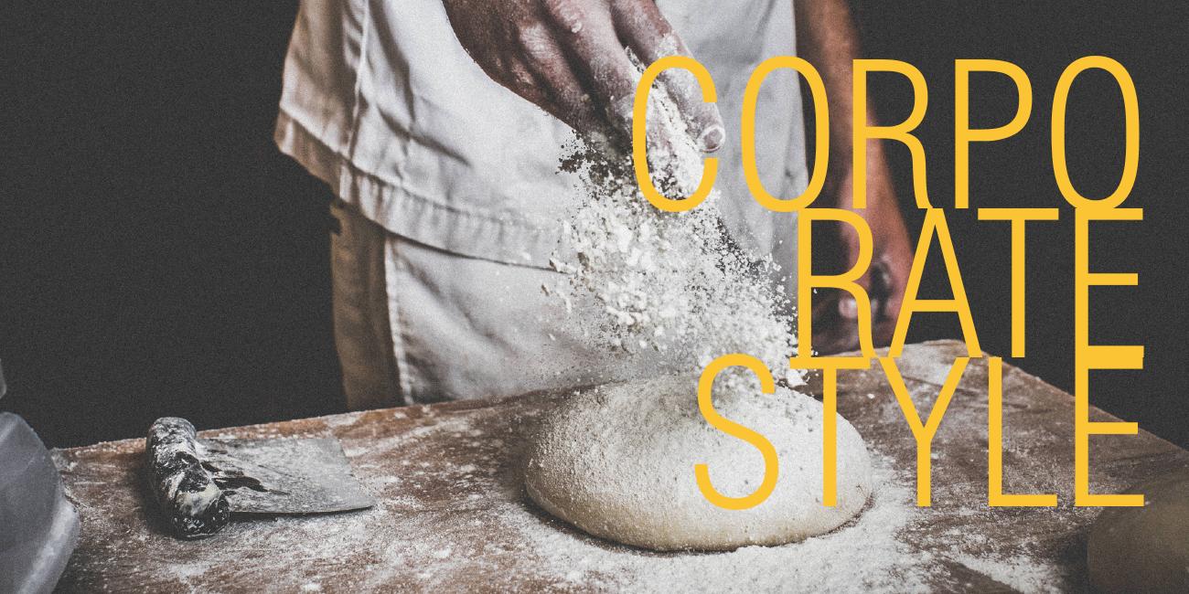
Corporate Style
Stationery closes the system, letterhead, cards and folders built from the same three colours, the condensed type and one Viva Beautiful accent. Even an invoice arrives smelling of the brand.
- Chapter
- The corporate style
- Range
- Letterhead, business cards, envelopes, folders
- Build
- Contents + logotype + typography
- Year
- 2026
All projects
View all workReady to build your next brand?.
Let's create something remarkable.