Lantana
A treasure of natural colors.
A botanical identity built from the flower itself, three petal-borrowed colours, a ribbon-drawn bloom, and a typographic pairing that sits between engraved craft and handwritten warmth.
- Sector
- Lifestyle & floral
- Services
- Brand spirit, identity system, corporate applications
- Palette
- Pantone 470 C · Pantone 7418 C · Cannoli Cream #F2F0E2
- Type
- The Seasons · Adelia
- Endline
- A treasure of natural colors
- Year
- 2026
Challenge
Lantana needed an identity that could feel delicate without feeling fragile, and hold together across invitations, cards and everyday corporate pieces with a very small toolkit.
Approach
We reduced the brand to a signature, a three-colour balance and two typefaces, The Seasons for structure, Adelia at 6° for the spoken moments, and wrote clear rules for where each belongs.
Outcome
A compact brand spirit book that keeps every application recognisably Lantana: warm, botanical and quietly composed.
Selected outputs
Logotype & Brand Sign
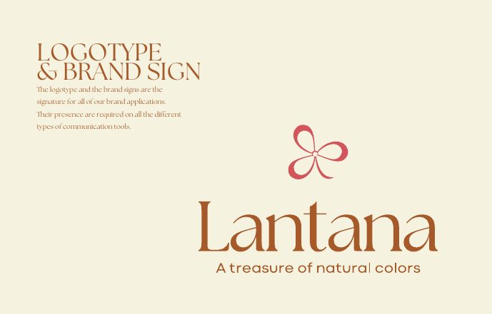
A four-petal bloom drawn in a single continuous ribbon sits above the wordmark, with 'A treasure of natural colors' as endline. Logotype and sign are the signature of the brand, one of them must appear on every communication tool.
- Chapter
- The tool kit
- Elements
- Logotype · Brand sign · Endline
- Rule
- Presence required on all applications
- Endline
- A treasure of natural colors
Colour System
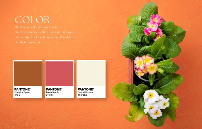
Three colours taken straight from the flower: Pumpkin Spice (Pantone 470 C), Baked Apple (Pantone 7418 C) and Cannoli Cream #F2F0E2. The recognition comes from the balance between them, white always holds the background.
- Chapter
- The tool kit
- Primary
- Pumpkin Spice, Pantone 470 C
- Secondary
- Baked Apple, Pantone 7418 C
- Neutral
- Cannoli Cream #F2F0E2 · White background
Typographies
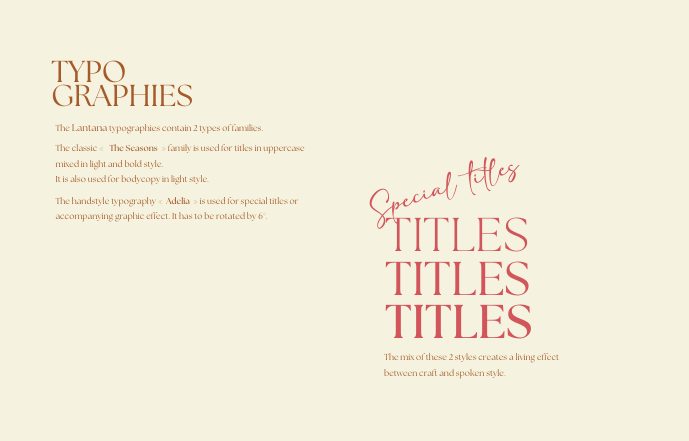
Two families, one living tension. The classic 'The Seasons' carries uppercase titles in light and bold and bodycopy in light; the handstyle 'Adelia', always rotated 6°, is reserved for special titles and graphic accents.
- Chapter
- The tool kit
- Primary
- The Seasons, uppercase, light & bold
- Accent
- Adelia, handstyle, rotated 6°
- Effect
- Between craft and spoken style
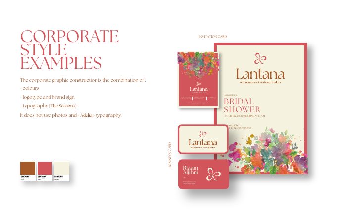
Corporate Style Examples
Invitation cards and business cards built from colour, logotype and The Seasons only, no photography, no Adelia. Watercolour florals do the decorating, so the corporate range stays composed while the brand stays warm.
- Chapter
- The examples
- Range
- Invitation card · Business card
- Rule
- No photos, no Adelia typography
- Year
- 2026
All projects
View all workReady to build your next brand?.
Let's create something remarkable.