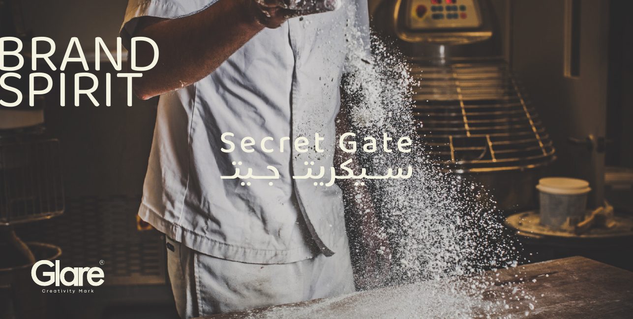
Secret Gate
French savoir-faire, opened in Riyadh.
A bilingual brand spirit for a Saudi bakery and café built on French craft, three colours, two typefaces, two photographic templates and a spoken hand that keeps it human.
- Sector
- Bakery & café / Hospitality
- Services
- Brand spirit, identity system, tone of voice, applications
- Palette
- Pantone 567 C · Cannoli Cream #F2F0E2 · White
- Type
- Baloo Thambi 2 · Viva Beautiful Pro
- Location
- Riyadh, KSA
- Year
- 2026
Challenge
Secret Gate needed a system that could read as authentically French without becoming a costume, and work equally in Arabic and Latin across menus, posters and corporate pieces.
Approach
We reduced the brand to four tools, logotype and sign, colour, typography, visual style, and defined exactly where each belongs, then added a hand-brushed voice, rotated 6°, for the moments that should feel spoken.
Outcome
A brand spirit book that works as a briefing platform: anyone can build a menu, a poster or a letterhead and it still arrives as Secret Gate.
Selected outputs
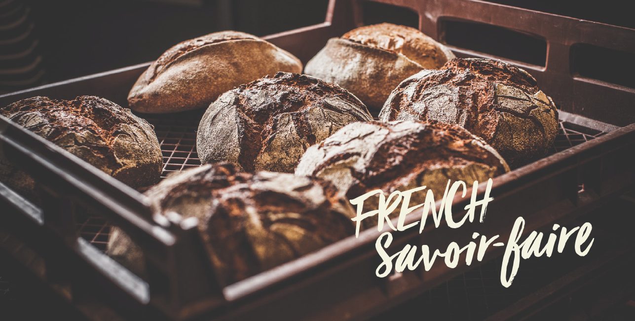
French Savoir-Faire
The opening chapter divider puts the promise before the rules, 'French savoir-faire' hand-brushed at a 6° tilt over ambient craft photography, the first appearance of the handstyle that carries the whole book.
- Chapter
- Introduction
- Device
- Viva Beautiful Pro, rotated 6°
- Role
- Positioning statement
- Year
- 2026
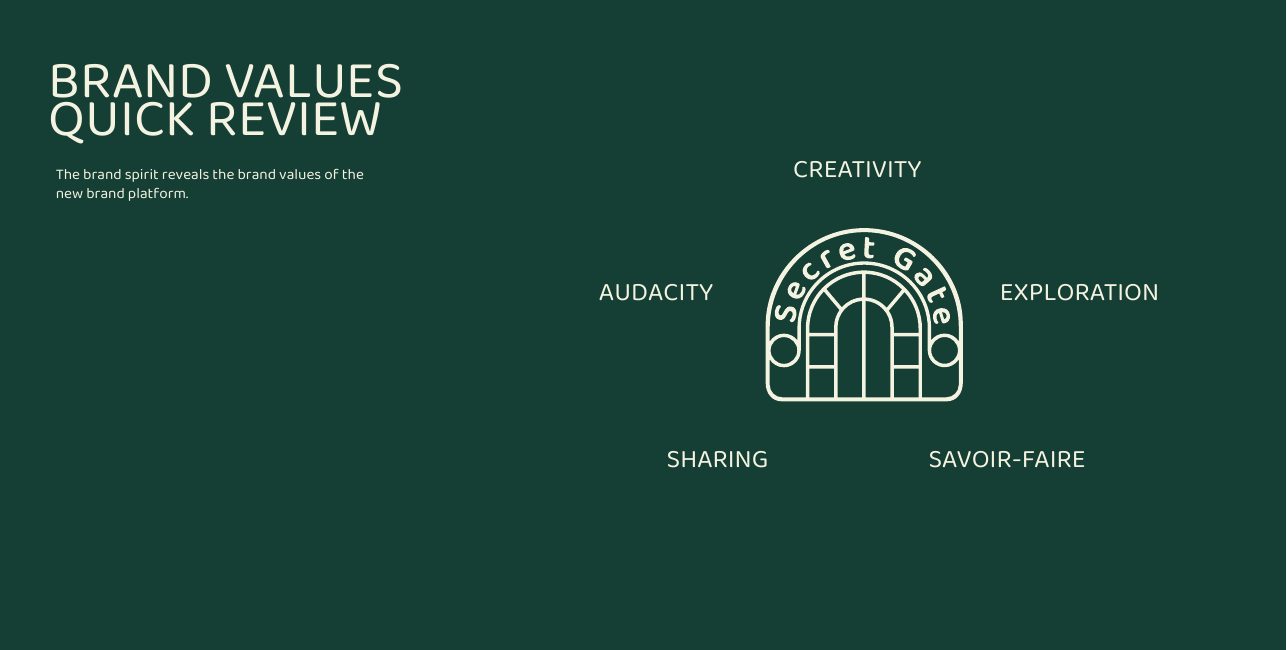
Brand Values
Five values hold the platform together, creativity, audacity, exploration, sharing and savoir-faire. Every later decision in the book is argued back to one of them rather than to taste.
- Chapter
- Introduction
- Values
- Creativity · Audacity · Exploration · Sharing · Savoir-faire
- Use
- Filter for campaign and product briefs
- Year
- 2026
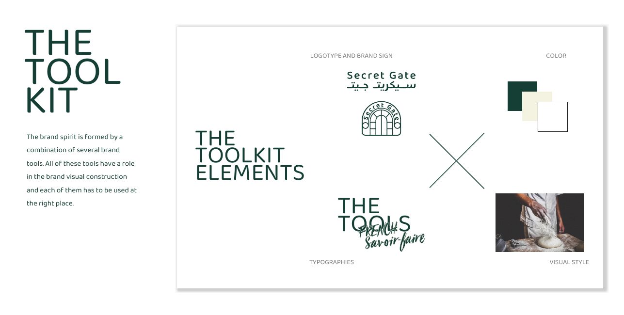
The Toolkit Elements
Four tools, one system: logotype and brand sign, colour, typographies and visual style. Each has a defined role, so nobody has to invent the brand again to make a poster.
- Chapter
- The tool kit
- Elements
- Logotype & sign · Colour · Typography · Visual style
- Principle
- Every tool used at the right place
- Year
- 2026
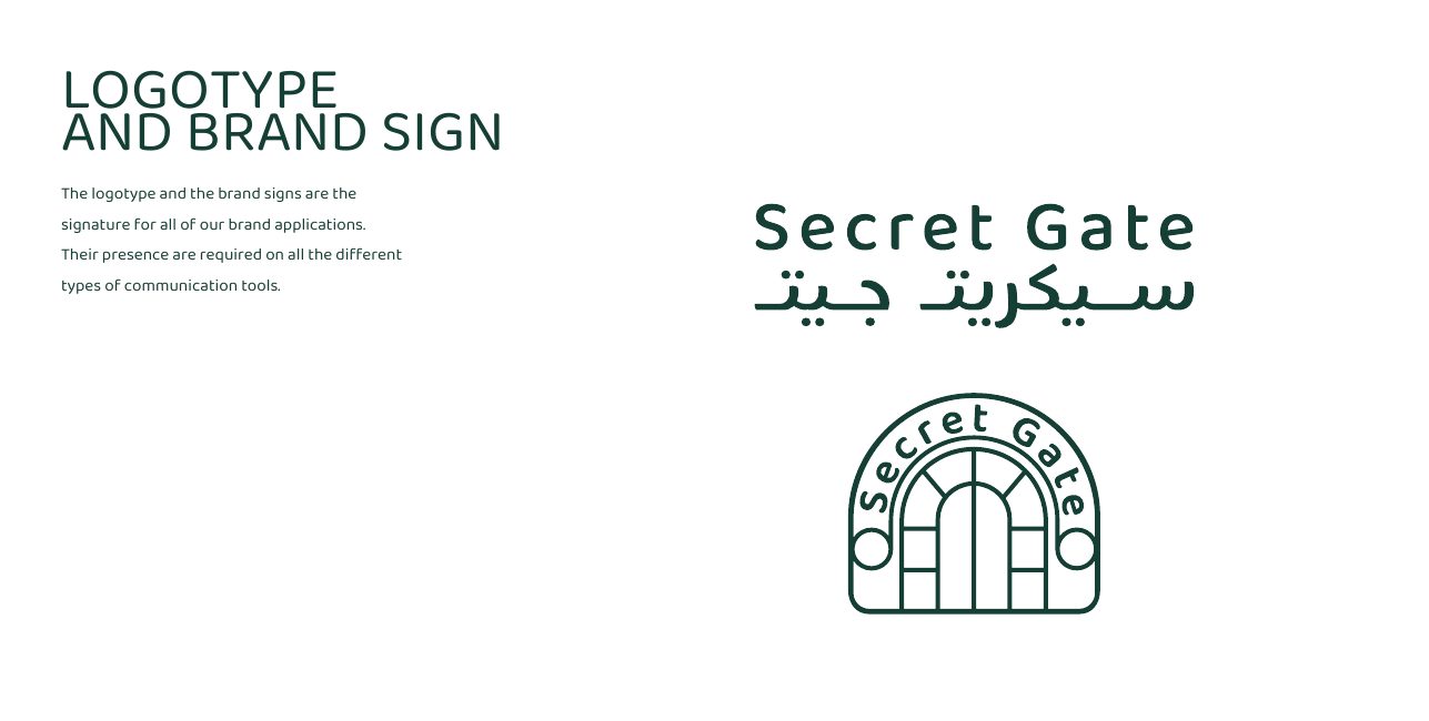
Logotype & Brand Sign
The signature set: the Secret Gate logotype with its Arabic lock-up and the brand sign that stands alone at small sizes. One of the two is required on every communication tool the brand issues.
- Chapter
- The tool kit
- Lock-up
- Bilingual, Latin and Arabic
- Rule
- Presence required on all applications
- Year
- 2026
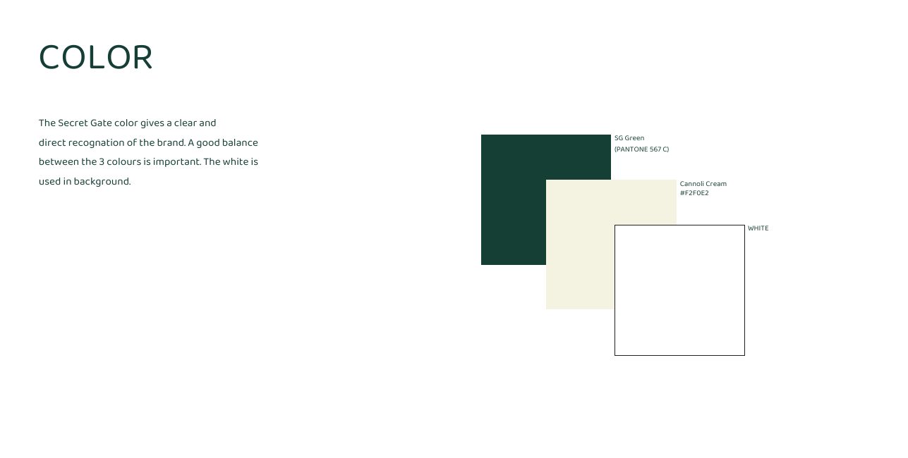
Colour System
Three colours, balanced: SG Green (Pantone 567 C) for authority, Cannoli Cream #F2F0E2 for warmth, and white doing the work in the background. The balance between them is what makes the brand recognisable at a glance.
- Chapter
- The tool kit
- Primary
- SG Green, Pantone 567 C
- Secondary
- Cannoli Cream #F2F0E2 · White
- Rule
- White holds the background
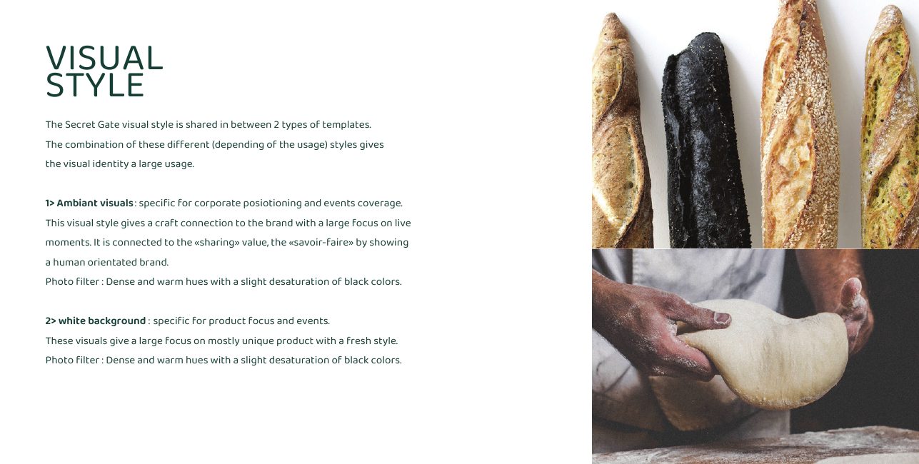
Visual Style, Two Templates
Two photographic templates cover everything: ambient visuals for corporate positioning and live moments, and white-background visuals for product focus. Both share one filter, dense warm hues with blacks slightly desaturated.
- Chapter
- The tool kit
- Template 1
- Ambient, craft, people, live moments
- Template 2
- White background, product focus
- Filter
- Dense warm hues, desaturated blacks
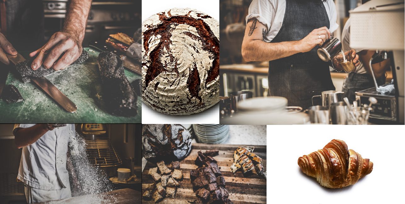
Photography Direction
The visual style shown rather than described, a spread of ambient and product frames that sets the reference level for every future shoot, from hands and ovens to a single pastry on cream.
- Chapter
- The tool kit
- Use
- Shoot reference and image selection
- Tone
- Human, warm, craft-led
- Year
- 2026
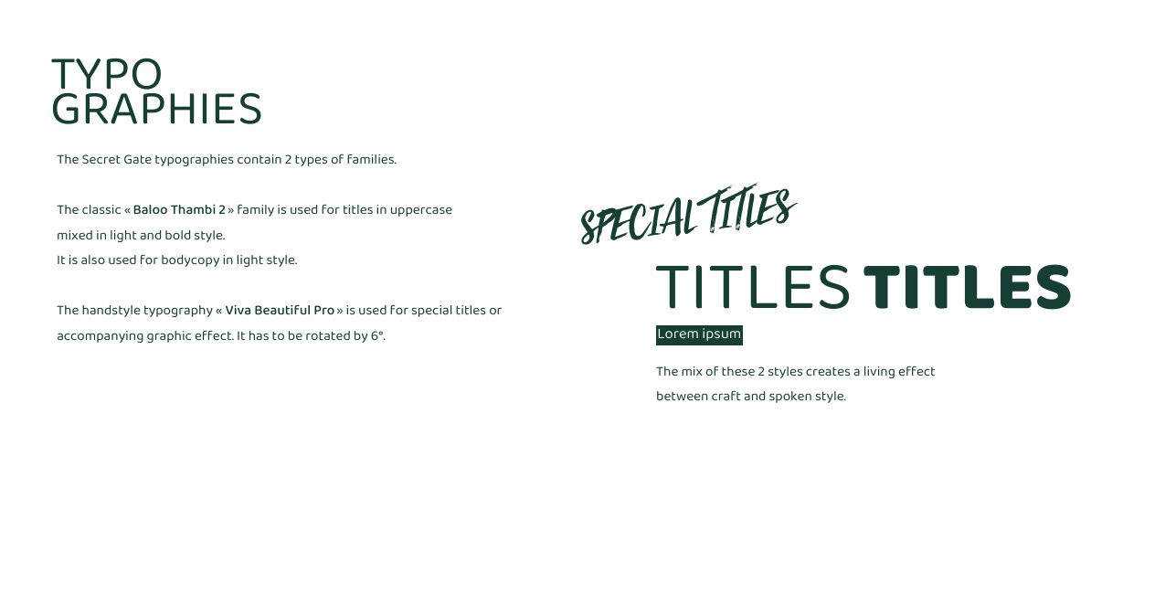
Typographies
Two families do all the talking. Baloo Thambi 2 in uppercase, light mixed with bold, carries titles and bodycopy; Viva Beautiful Pro, always rotated 6°, adds the spoken hand. The mix is what keeps the system alive between craft and conversation.
- Chapter
- The tool kit
- Primary
- Baloo Thambi 2, light & bold, uppercase
- Accent
- Viva Beautiful Pro, handstyle, 6° rotation
- Rule
- Handstyle reserved for special titles
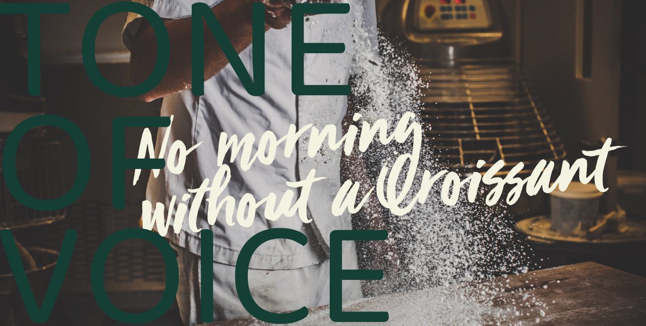
Tone of Voice, Opening
The voice chapter opens the way the brand speaks: a fragment of a line, hand-brushed across a photograph, finished before you expect it to be.
- Chapter
- Tone of voice
- Style
- Short, bold, free and positive
- Accent
- A French sense of humour
- Year
- 2026
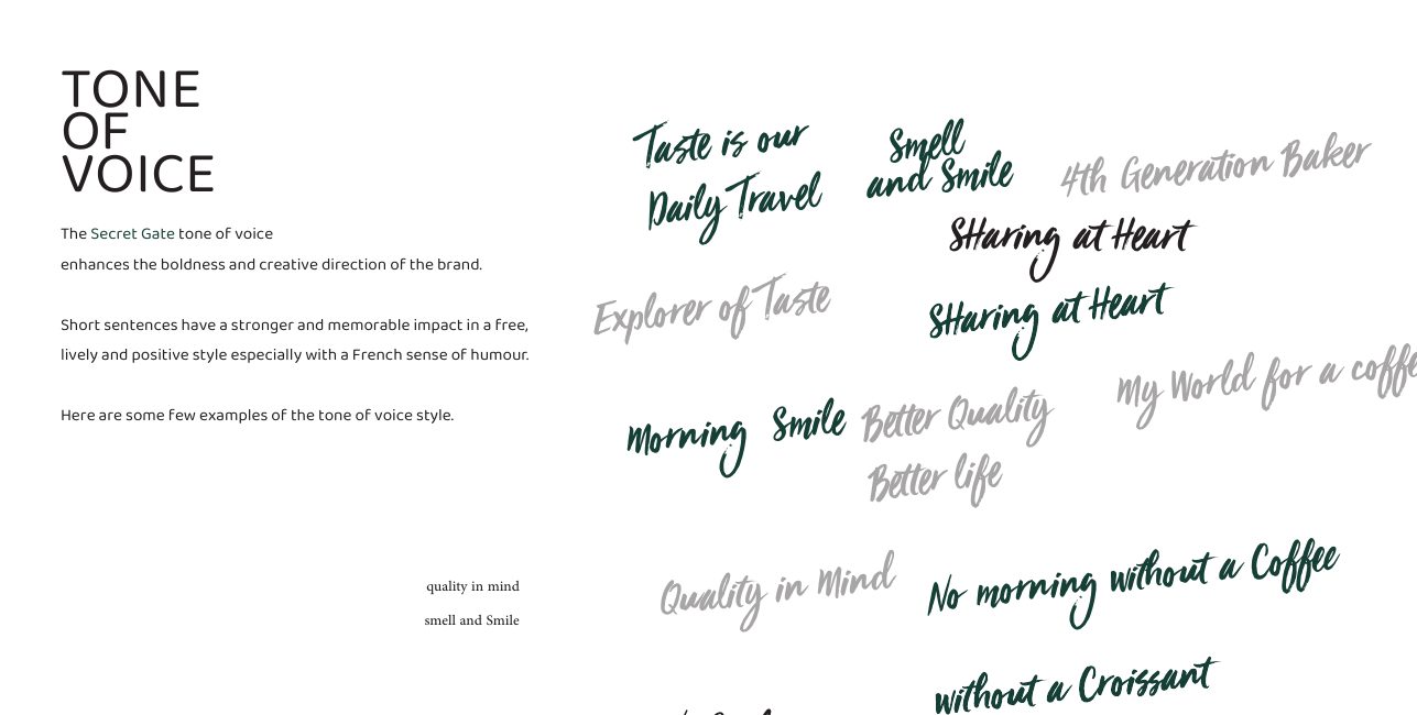
Voice Line Library
A working library of brand lines, 'Taste is our Daily Travel', 'Smell and Smile', 'Sharing at Heart', '4th Generation Baker', 'Better Quality Better Life'. Short sentences, drawn as artwork, so the brand always speaks in the same hand.
- Chapter
- Tone of voice
- Lines
- Taste is our Daily Travel · Smell and Smile · Sharing at Heart
- Use
- Posters, packaging, social, in-store
- Year
- 2026
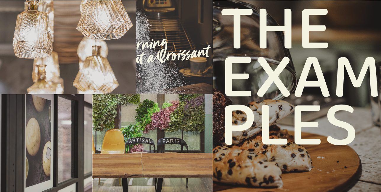
The Examples, Divider
The turn from rules to reality. From here the book stops explaining the toolkit and starts showing what it builds, menus, posters and corporate pieces made only from the four tools.
- Chapter
- The examples
- Role
- Application section divider
- Rule
- Nothing new introduced past this point
- Year
- 2026
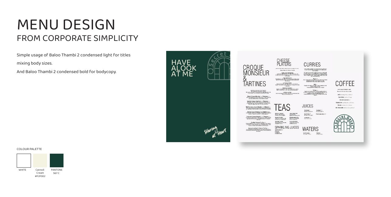
Menu Design
Menus built from corporate simplicity, Baloo Thambi 2 condensed light for titles with mixed body sizes, condensed bold for the copy, and the three-colour palette carrying the hierarchy instead of rules and boxes.
- Chapter
- The examples
- Type
- Baloo Thambi 2 condensed, light & bold
- Palette
- White · Cannoli Cream · Pantone 567 C
- Application
- In-store menus and boards
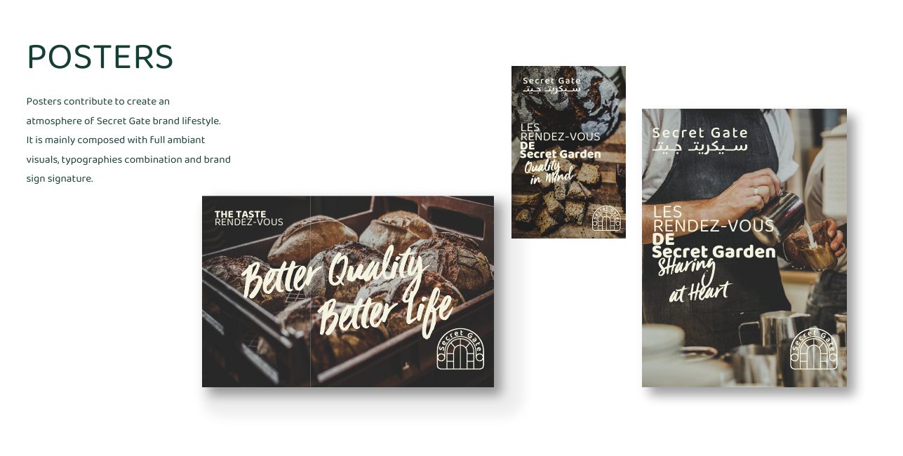
Posters
Posters carry the lifestyle: a full-bleed ambient visual, the typography combination on top, and the brand sign as signature. 'Les Rendez-vous de Secret Gate' becomes a repeatable campaign format rather than a one-off layout.
- Chapter
- The examples
- Build
- Ambient visual + typography + brand sign
- Format
- Repeatable campaign template
- Application
- In-store, façade, events
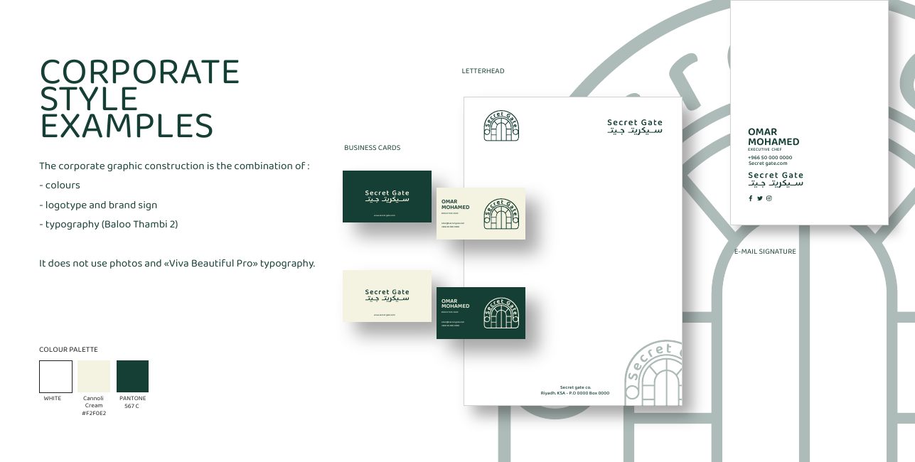
Corporate Style
Stationery closes the system, letterhead, business cards and e-mail signature built only from colour, logotype and Baloo Thambi 2. No photography, no handstyle: the corporate face stays deliberately quiet.
- Chapter
- The examples
- Range
- Letterhead, business cards, e-mail signature
- Rule
- No photos, no Viva Beautiful Pro
- Location
- Riyadh, KSA
Closing, Let's Collaborate
The book signs off the way the brand does: short line, warm colour, open invitation. A brand spirit is only useful if the people using it keep talking to each other.
- Chapter
- Thank you
- Role
- Closing and contact page
- Studio
- Glare, Creativity Mark
- Year
- 2026
All projects
View all workReady to build your next brand?.
Let's create something remarkable.